Mies van der Rohe was drawn to the transparency and brilliance of glass, the harmony of images, and organic architecture. “Less is more” is a laconic phrase that describes the deep meaning of his work.
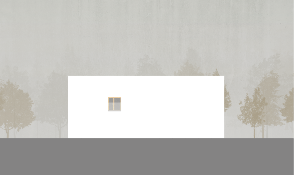
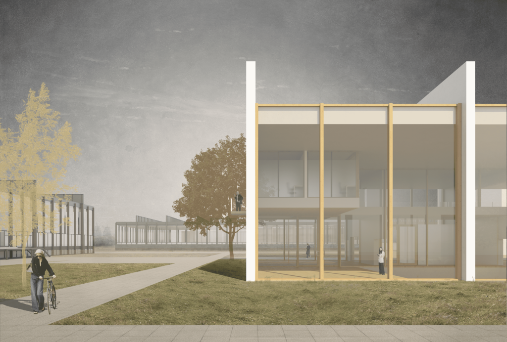
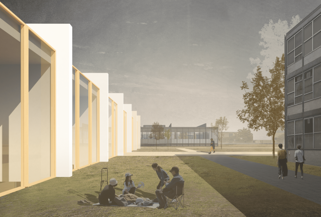
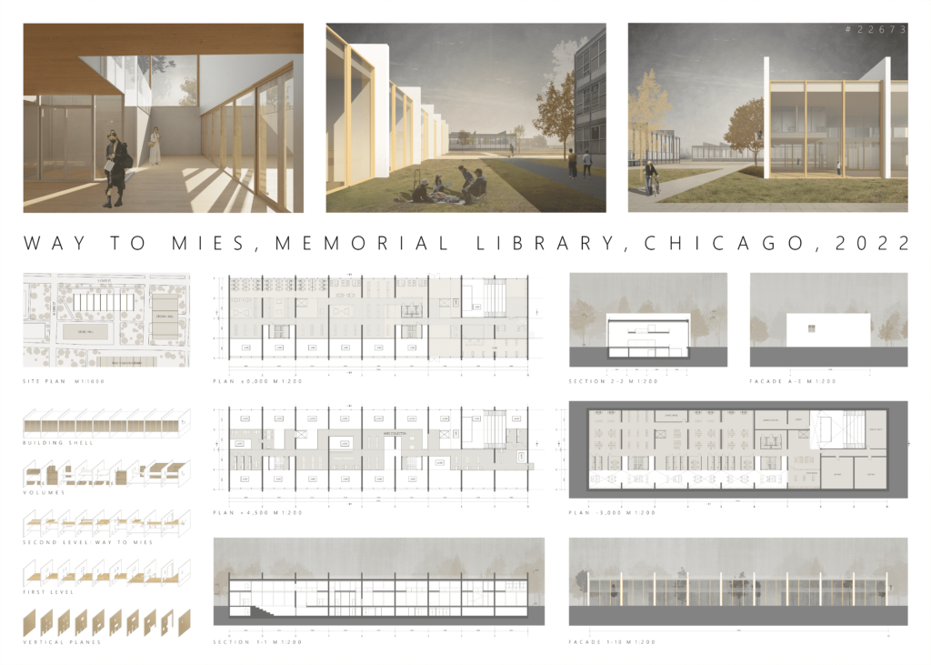
Continuing his idea, we concentrated on the interior of the building, leaving the outer surface as simple as possible. The combination of glass and outer blank walls plays an important role in our concept. The building is transparent, organically fitting into the environment, but it is not completely invisible.
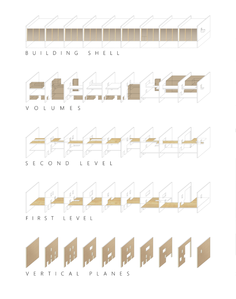
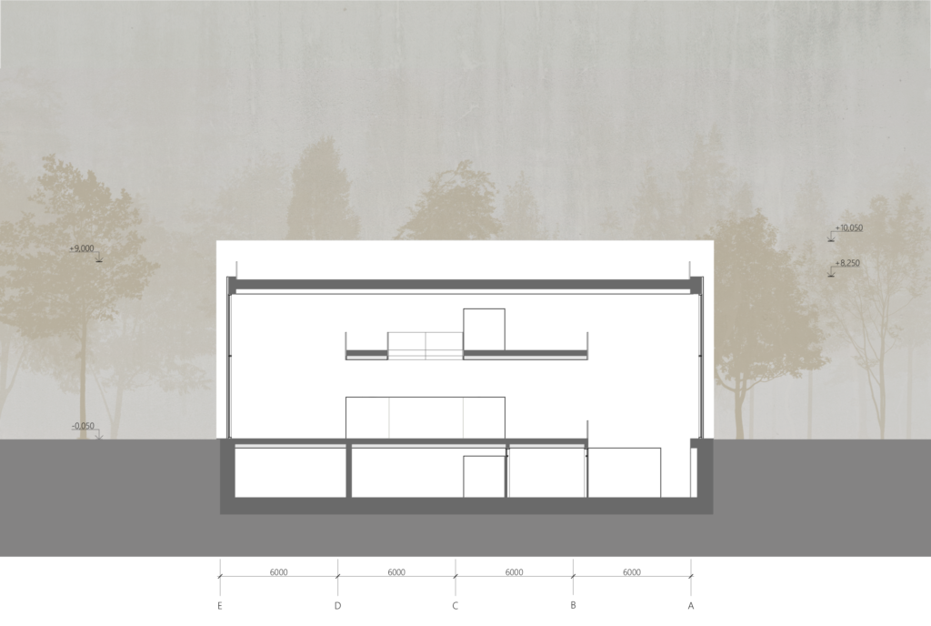
The object consists of three levels.
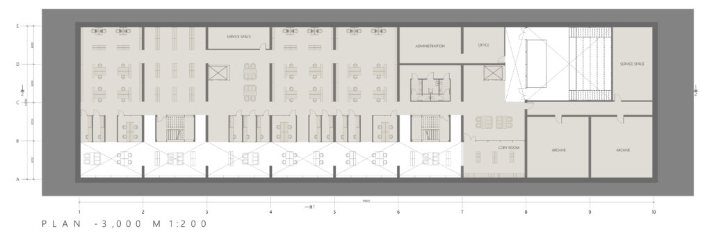
At the level of the first floor, there is an entrance group that separates the main space of the library. On the one hand, there are reading rooms, on the other – a lecture hall and a bookstore.
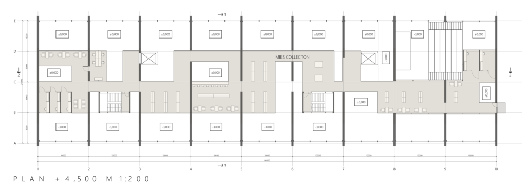
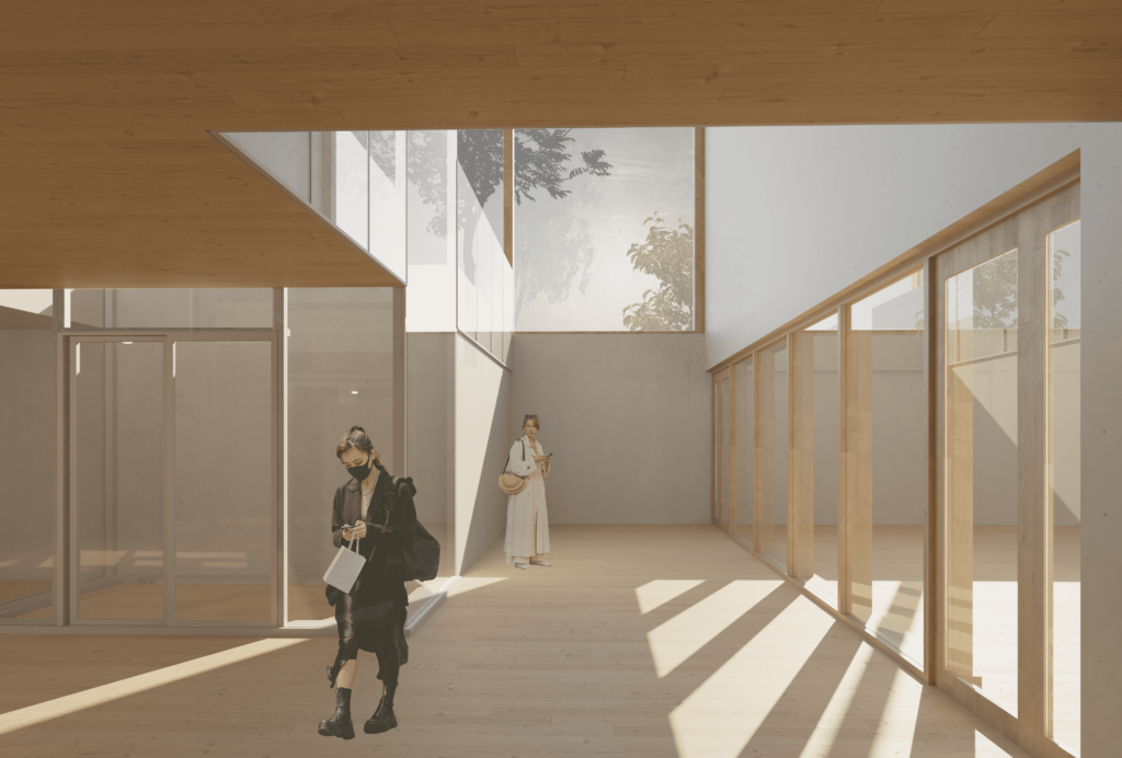
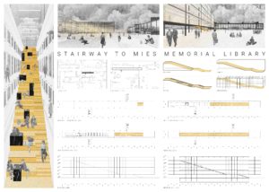
The main idea of the project is the second floor, “Way to Mies”. It is entirely dedicated to the collection of Ludwig Mies van der Rohe. The height of the floor provides only reflected light, which guarantees the safety of valuable pieces of the collection. This level also includes private rooms overlooking the various spaces of the library.
Way to Mies makes the visitor wind around the second floor, involuntarily passing through various exhibition spaces. One of the exhibits was the Crown Hall itself. The view of it opens from a small balcony, cut through in one of the outer blank walls.
Way to Mies
This project was submited to the Honorable Mention competition with Registration ID #22673
AxA
Shadchneva Alyona Ruslanovna
Architecture and Civil Engineering Academy of Samara State Technical University
asharu_chi
Podlesnova Anastasia Sergeevna
Architecture and Civil Engineering Academy of Samara State Technical University
anasteysha_les
read more +
