The ionterior of the project
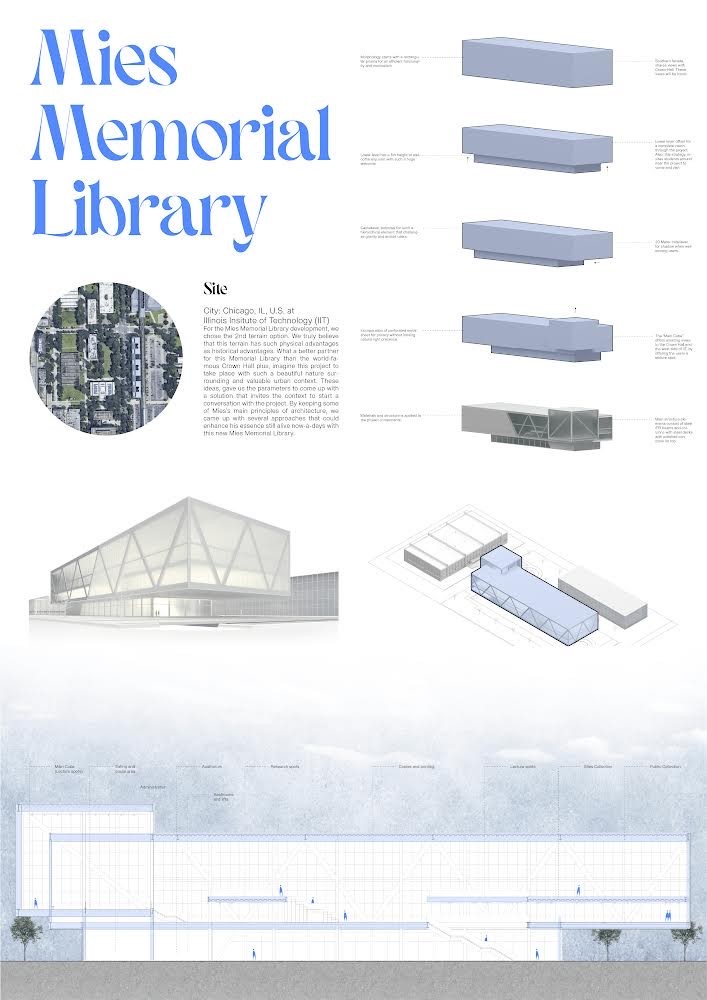
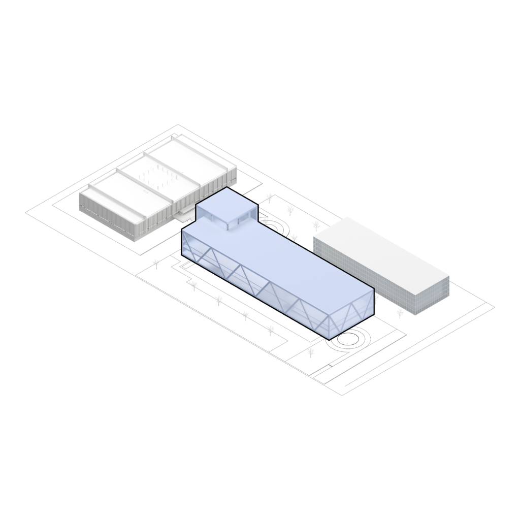
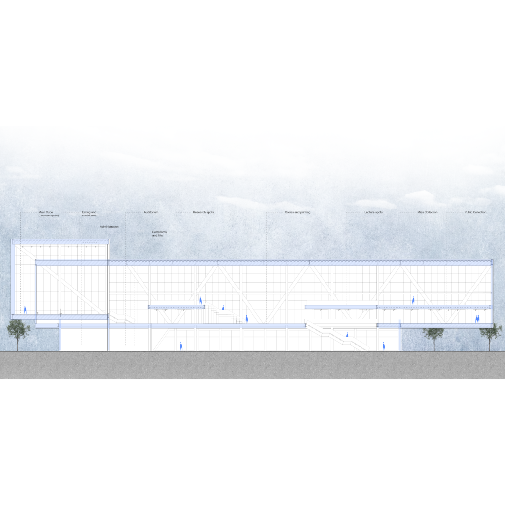
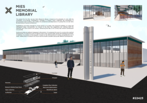
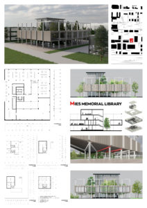
To design the interior space of the library we based our design on generating open spaces that invite people to get to know the whole project, both the exterior and the interior.
One of the main purposes of the interior of the bookstore is to invite people to be part of a historical tour of the architecture that has evolved over the years by interacting with a space where they can study, work, talk and even rest.
We decided to distribute the interior floor of the project in such a way that people are encouraged and intrigued by what lies beyond the spaces that can be seen at first glance.
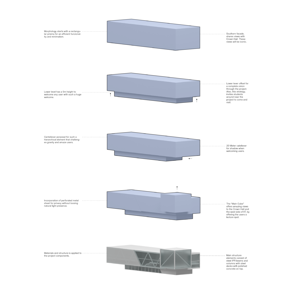
For the architectural composition of the bookstore, we decided to implement methodologies that Mies used to use constantly in his works, with the aim of creating an innovative architecture that preserves the history of his past.
The materials
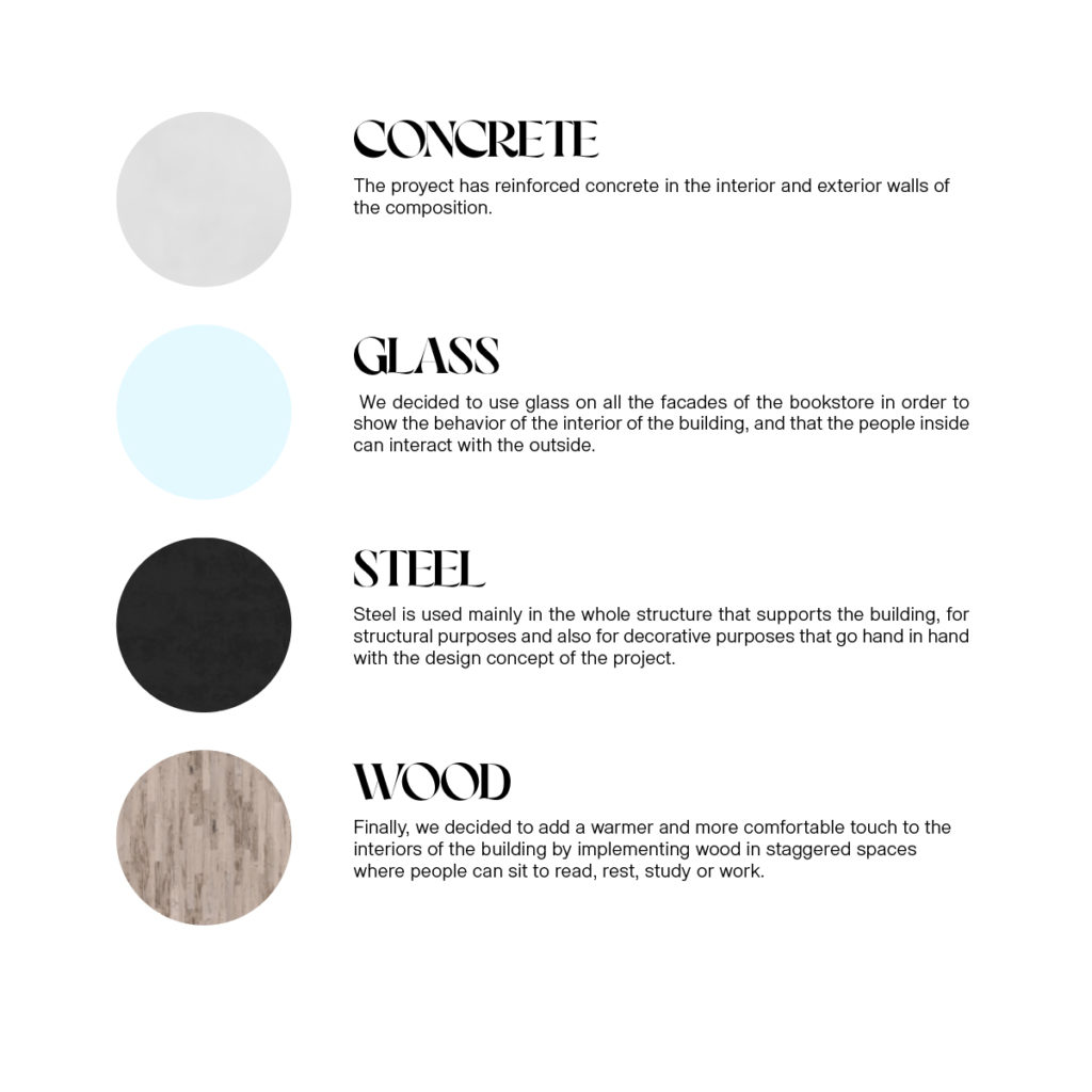
The proyect has reinforced concrete in the interior and exterior walls of the composition.
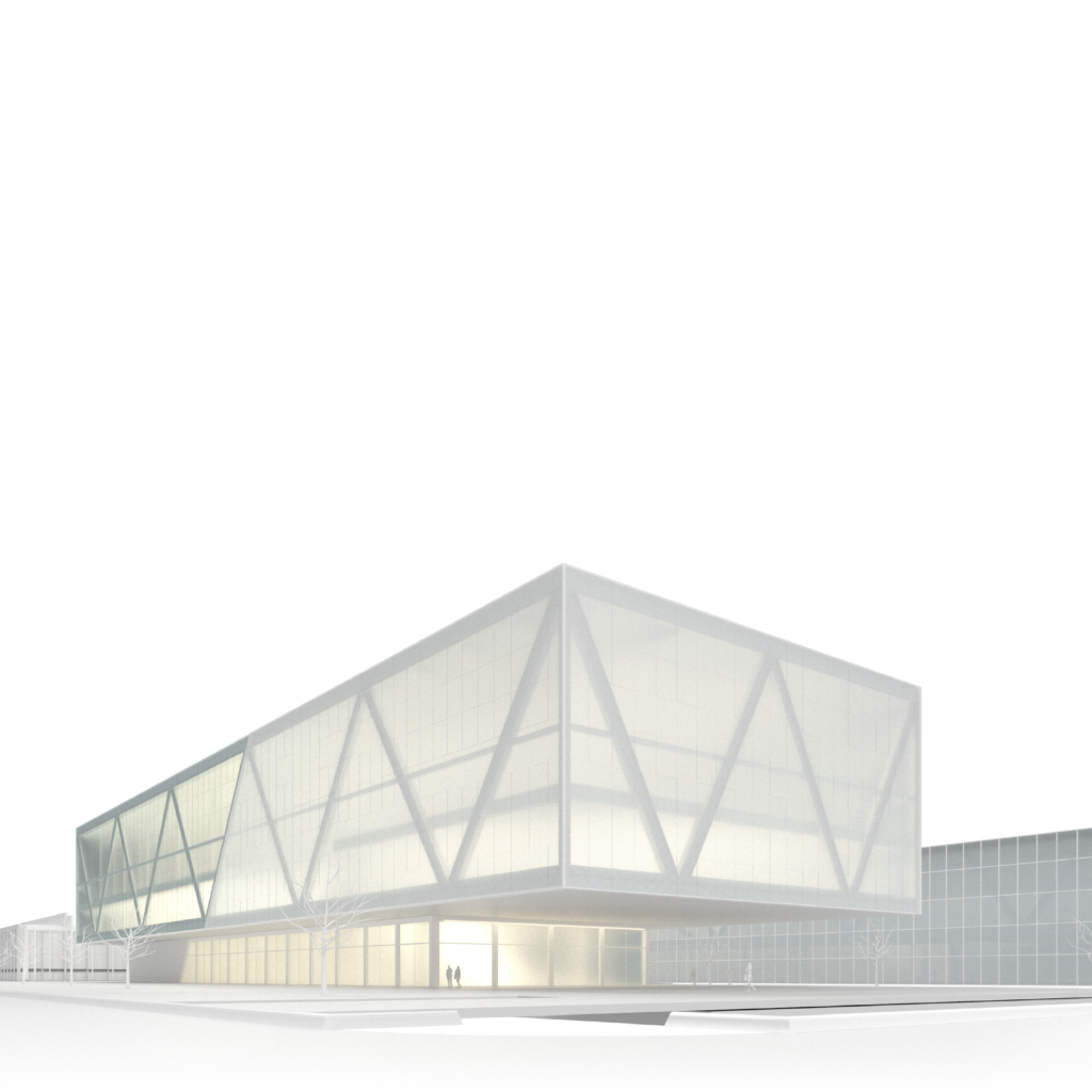
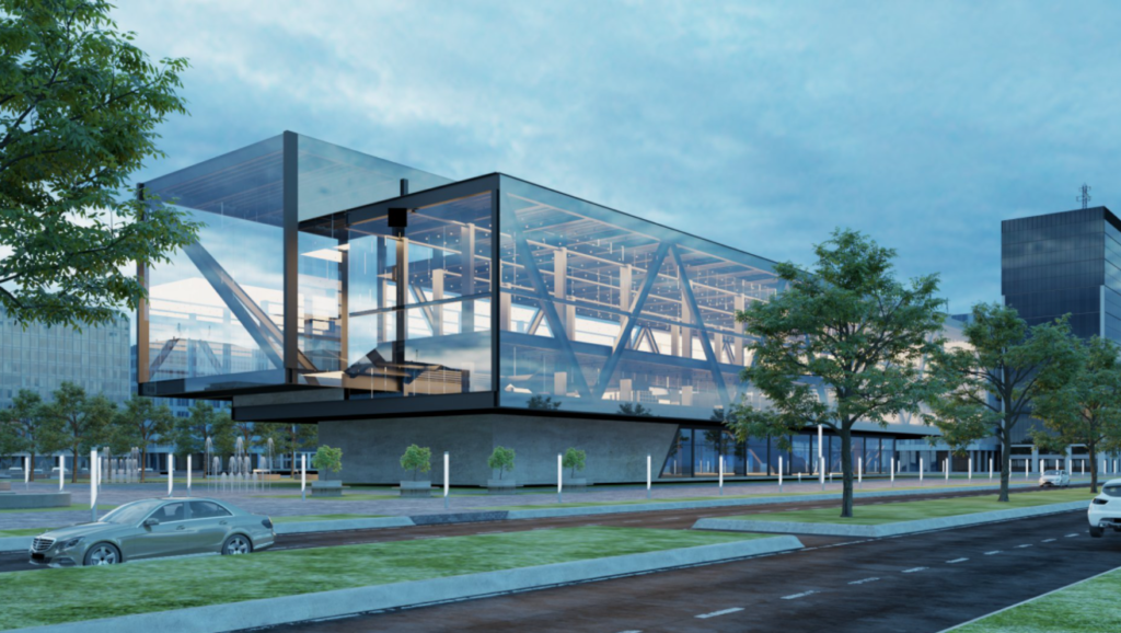
We decided to use glass on all the facades of the bookstore in order to show the behavior of the interior of the building, and that the people inside can interact with the outside.
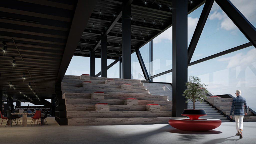
Steel is used mainly in the whole structure that supports the building, for structural purposes and also for decorative purposes that go hand in hand with the design concept of the project.
Finally, we decided to add a warmer and more comfortable touch to the interiors of the building by implementing wood in staggered spaces where people can sit to read, rest, study or work.
