CONCEPT
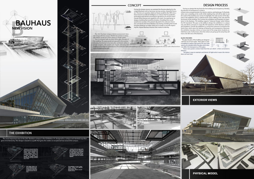
During the design process we analyzed the theories attached to the original Bauhaus such as harmony, serving society, a beautiful future, etc. This led us to question what our future would be like. Will is be a future based on artificial intelligence or a future that has peaked in technology and will force humanity to go back to its ancient roots? Overall, these theories set a goal for us to reach. Our goal being, to design a building that would be timeless. A building that would would serve society in the present day and in the unknown future. Our concept for the future Bauhaus was having a building that would function perfectly no matter what era it is made in and still respecting the original Bauhaus theories that creates its identity.
The 2021 Bauhaus campus interior environment does not change with the seasons. Whether its summer or winter, the interior landscape of the campus is always green. This is achieved with the help of the glass facades of the building. The glass panels are opened in the summer allowing the interior to be naturally ventilated; while in winter seasons, the panels are closed, allowing the building to function as a greenhouse. This method enables the building to be naturally heated and also grants the interior with a fixed environment throughout the year.
DESIGN PROCESS
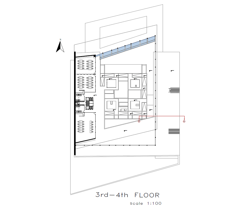
During our design the key factor for the building was transparency. Notably, the element of transparency is what le d there to be a merge between the interior, exterior, and landscape. To illustrate, when one is standing at the north of the building they will still be able to see the south of the building (vice versa). To highlight, the main section of the Bauhaus is the exhibition and it is placed at the center making it the core and the focal point of the building. This iconizes the exhibition and illustrates its importance in the Bauhaus. The building respects “Universal Design’ which follows the ISO standards. This gave us the ability to design the exhibition in a unique way and allows everyone to enjoy the full experience of the Bauhaus without any limitations. Overall, the exhibition is a ramp that continues to ascend to the fourth floor which gives the feelings of hierarchy and transparency. Moreover, the exhibition has glass vitrines on every level of the ramp where students exhibit their work. Furthermore, when the visitors are going up the ramp they will have a full 360 view of the Bauhaus.
GLASS FACADES
The glass facades of the building are designed with the use of Nano-glass. Nano glass is used in buildings to replace solar panels, the Nano solar panels are imbedded within the glass which does not affect the transparency of the glass. These Nano panels conduct heat from the sun which is then converted to electricity. The glass is easy to maintain and blocks UV light which means the interior does not over heat.
THE EXHIBITION
The most important area in the 2021 Bauhaus campus is the Exhibition. It’s designed in a unique and detailed way that gives it its hierarchy. The design is based on a path that gives the visitor an exceptional tour around the campus.
1. Based on a ramp that identifies the circulation of the campus. It follows the ISO standards (6% incline) which respects The “Universal Design” criteria. The exhibition is made up of vitrines in which the exhibits are placed, this method protects the exhibits and also increases their values.
2. It leads visitors through a path that circles up the interior of the building and is connected to every level above level 0. The exhibition is also the linking element that ties the different spaces within the campus together.
3.This design allows visitors to experience a panoramic view of the interior while also viewing the exhibits placed in the vitrines.
4.The exhibition is colour coded. Yellow: defines the different levels of the ramp. Red and Blue : Used for visualizing the vitrines.
read more +


