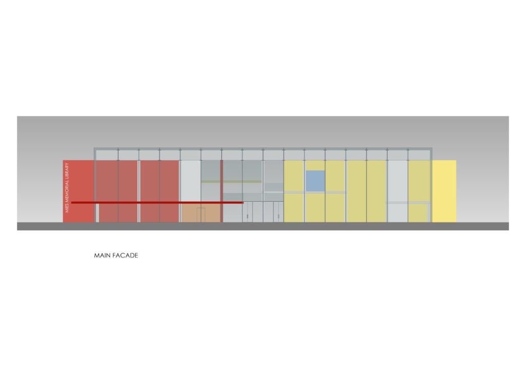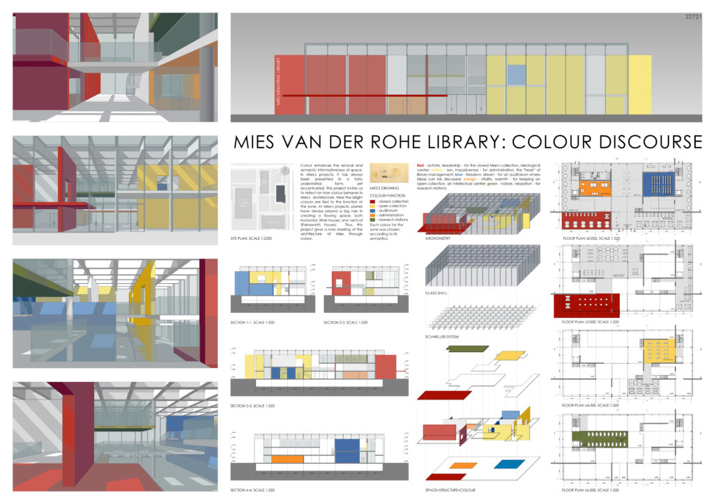
MIES VAN DER ROHE LIBRARY: COLOUR DISCOURSE
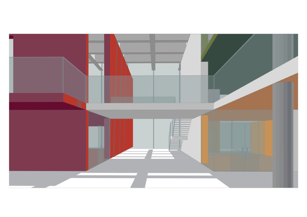
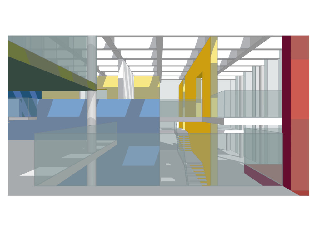
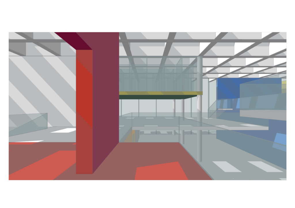
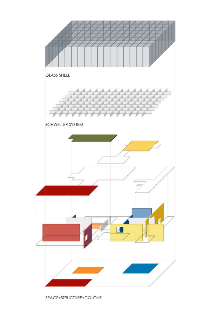
Colour enhances the sensual and semantic informativeness of space. In Mies’s projects, it has always been presented in a fairly understated form, yet accentuated. This project invites us to reflect on how colour behaves in Mies’s architecture. Here the bright colours are tied to the function of the zone. At Mies’s projects, planes have always played a big role in creating a flowing space, both horizontal (Wall house) and vertical (Farnsworth house). Thus, this project gives a new reading of the architecture of Mies through colour.
COLOUR+FUNCTION
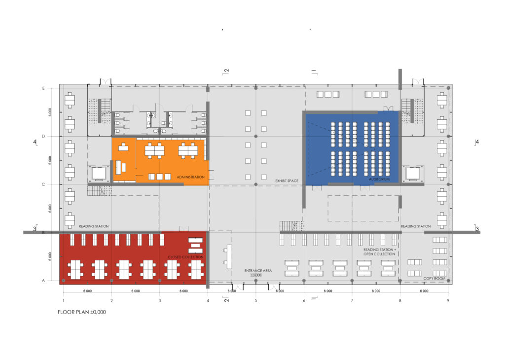
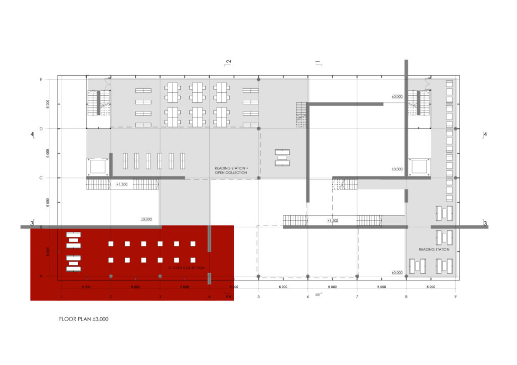
– closed collection
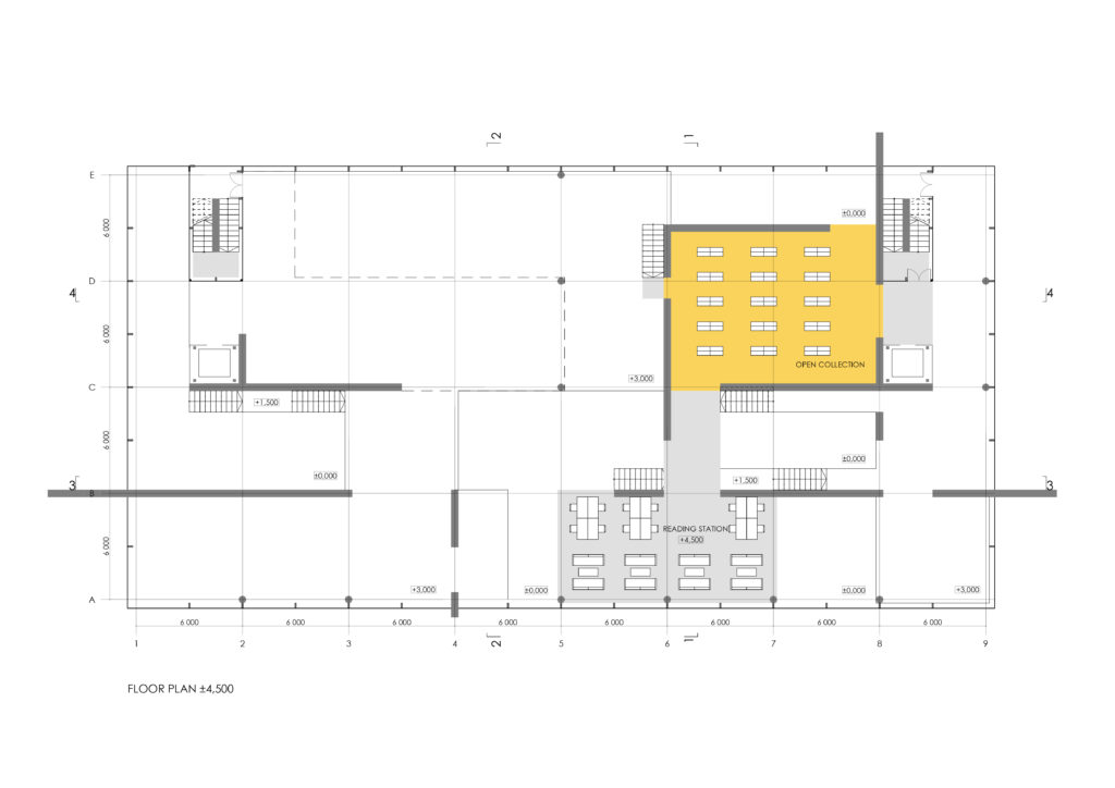
– open collection
– auditorium
– administration
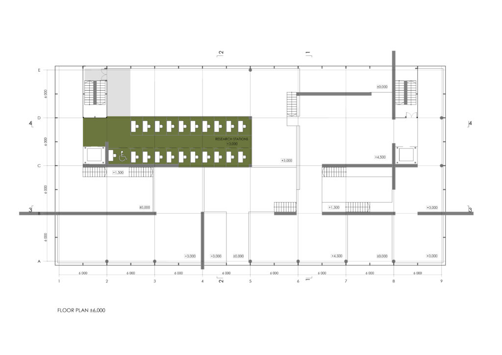
– research stations
Each colour for the zone was chosen according to its semantics.
Red – activity, leadership – for the closed Mies’s collection, ideological center; yellow – sun, impulsiveness – for administration, the “heart” of library management; blue – freedom, dream – for an auditorium where ideas can be discussed; orange – vitality, warmth – for keeping an open collection, an intellectual center; green – nature, relaxation – for research stations.
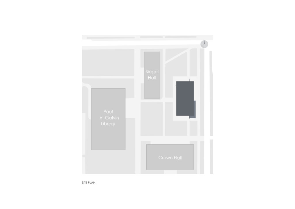
SITE PLAN, SCALE 1:2500
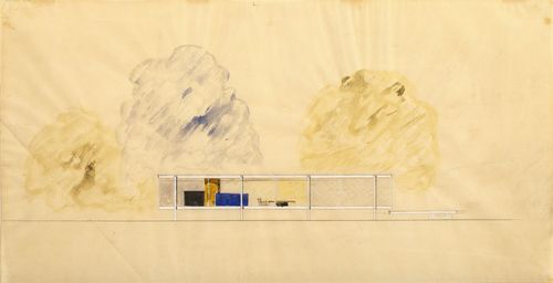
MIES’S DRAWING
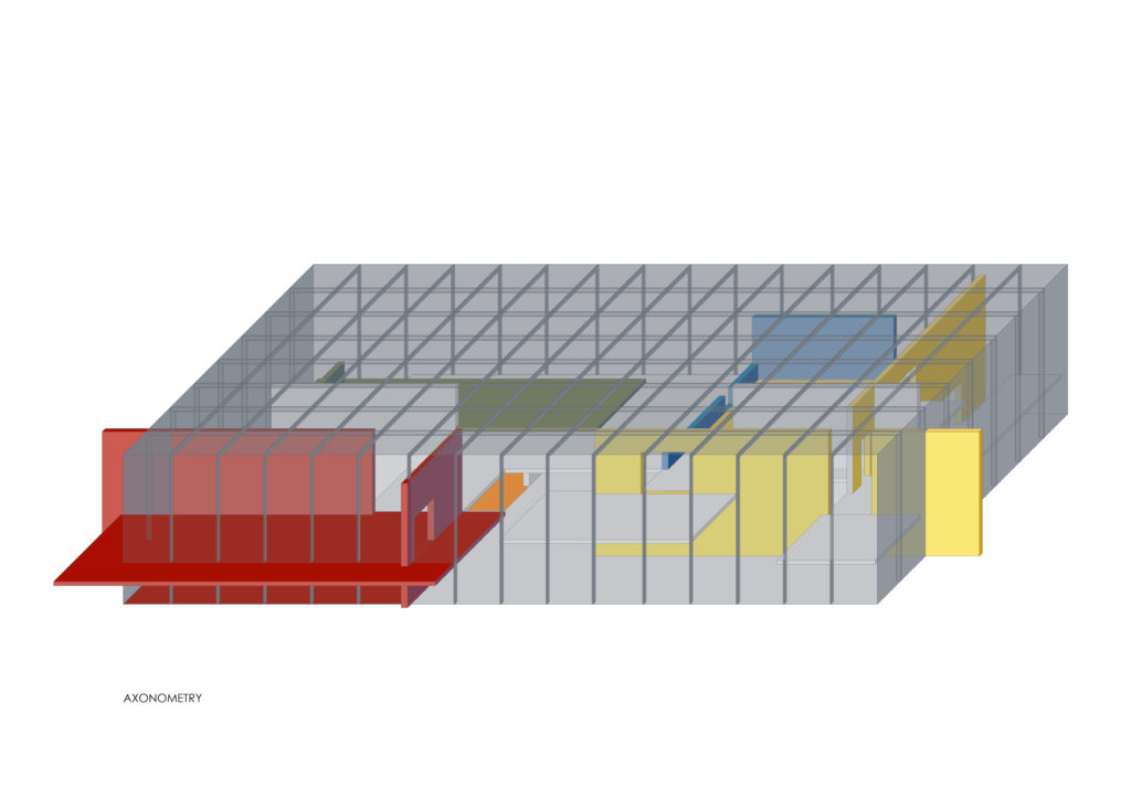
AXONOMETRY
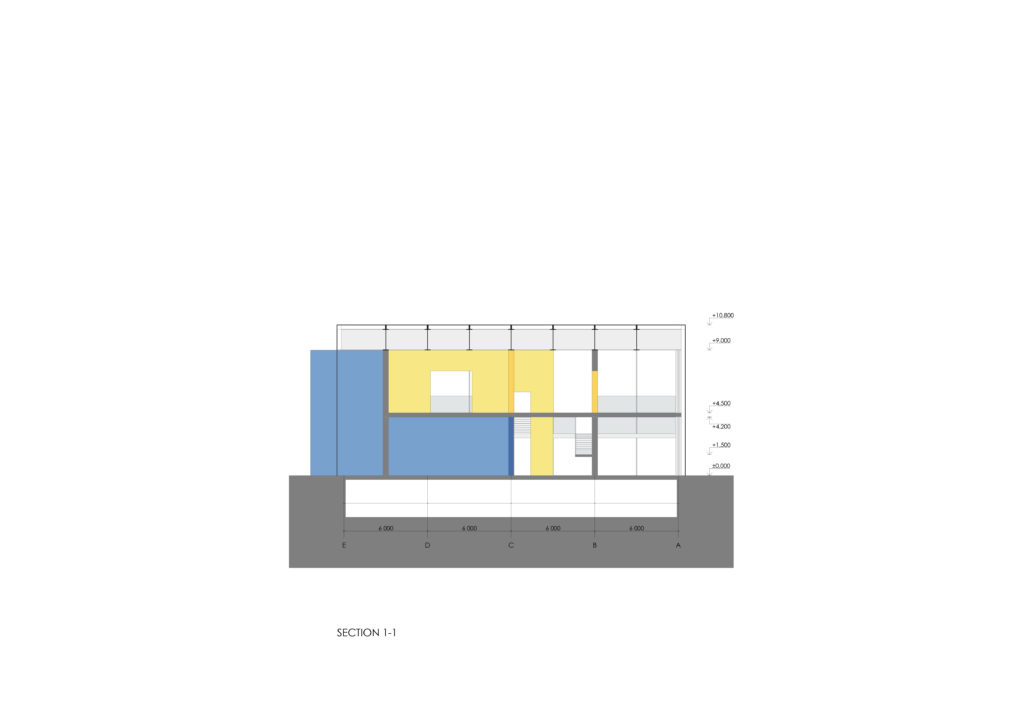
SECTION 1-1, SCALE 1:320
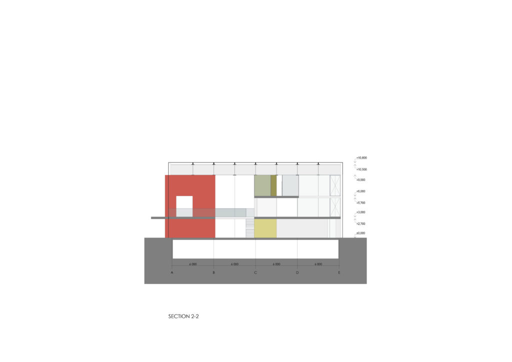
SECTION 2-2, SCALE 1:320
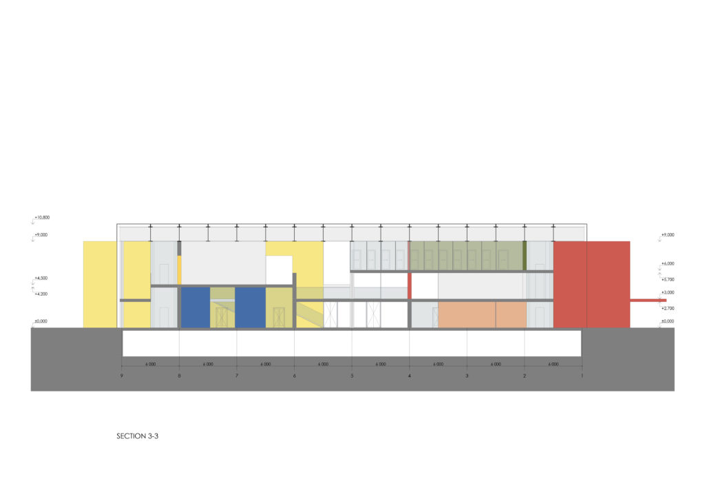
SECTION 3-3, SCALE 1:320
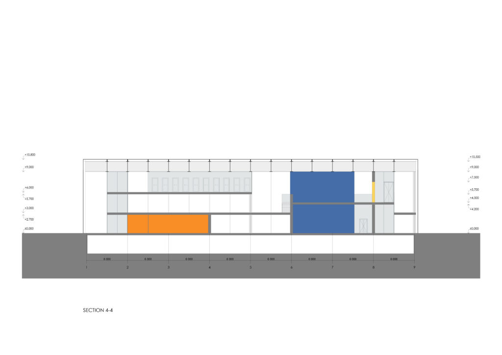
SECTION 4-4, SCALE 1:320
GLASS SHELL
SCHWELLER SYSTEM
SPACE+STRUCTURE+COLOUR
FLOOR PLAN ±0,000, SCALE 1:320
FLOOR PLAN ±3,000, SCALE 1:320
FLOOR PLAN ±4,500, SCALE 1:320
FLOOR PLAN ±6,000, SCALE 1:320