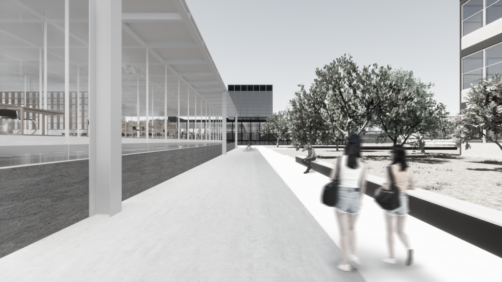
Understanding Mies’ work, we sought to potentialize dematerialization — a familiar concept in his projects. In which the constructive elements meet as planes and loose lines. Based on this intent, the plan becomes contemporaneous. While at the same time making a bridge between Mies’s previous works and promoting the project’s distinguishability with the other buildings on the campus and in the surroundings.
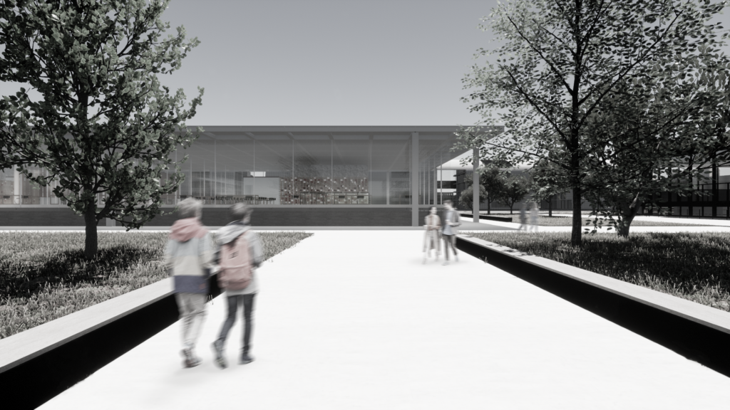
This concept appears in the composition of the constructive elements. The columns have a chrome finish that reflects the look of the surroundings and emphasizes the idea of the roof as a loose and individual plane. The facade set back in the structure is composed of glass panels that stick out of the slab, creating a contemporary interpretation of Mies’ work.
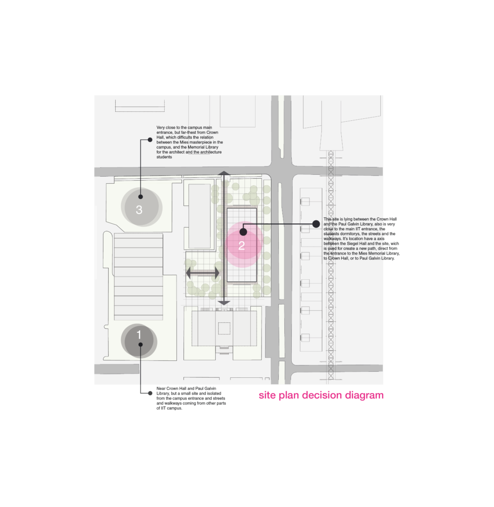
Born within this dichotomy between the new and the classic, the site plan of the memorial follows the campus’s original plan. It’s a call to the past inserted in an already consolidated landscape that seeks to enhance the visual axis between the new building and the Crown Hall, creating along with the new access a new perspective for Mies’ work. Through this new axis, the modulation emphasizes the new building, which repeats the grid proposed by the Crown Hall, referencing and maintaining the look of the site.
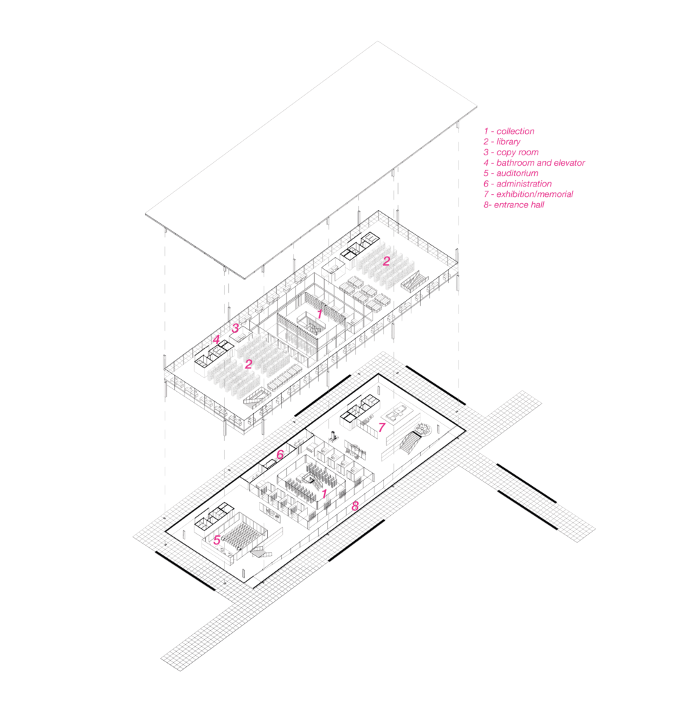
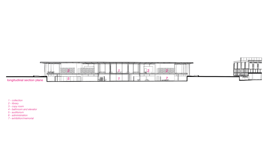
The distribution of the architectural program seeks to enhance the collection containing Mies’s works. It’s placed in an atrium in the middle of the building that crosses the two proposed floors, putting his archive in view creating an orthogonal axis of symmetry that divides the program.
The access happens through ramps that flow to the lower floor, which places the reception in front of Mies’s archives. The user can then access the auditorium and administrative area on one side and the other the exhibition area that tells the story and importance of the contribution of Mies’ work to architecture. The exhibition area gives access to the upper floor, where the library and study areas are, with an uninterrupted and privileged view of the campus.

