BAUHAUS CAMPUS 2021
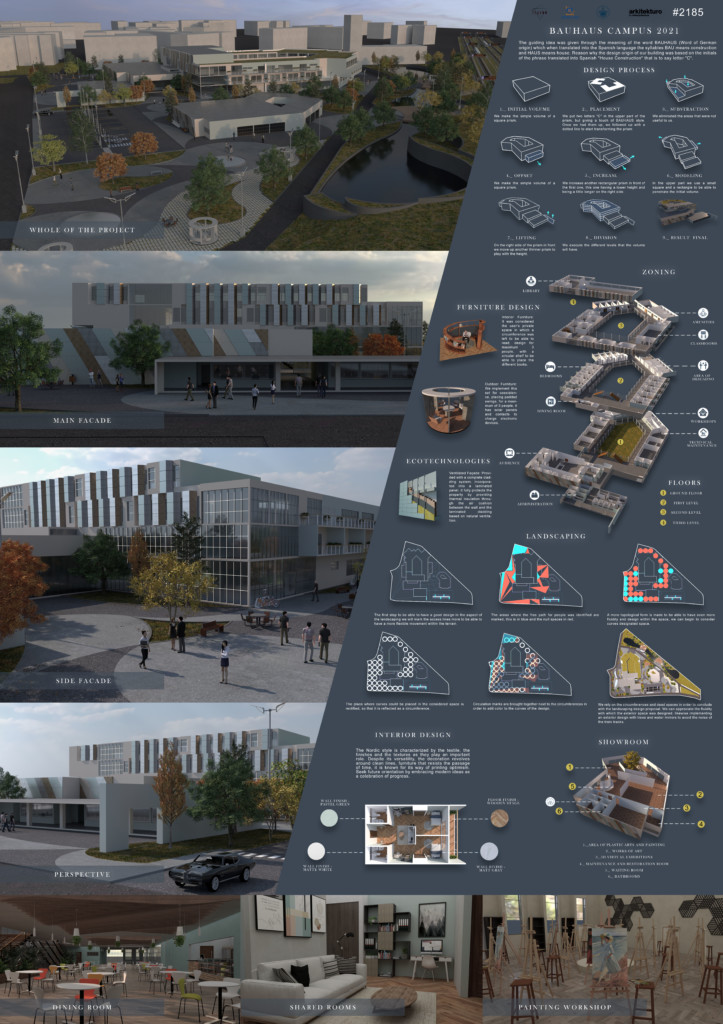
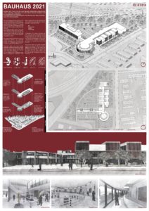
The guiding idea was given through the meaning of theword BAUHAUS (Word of German origin) which whentranslated into the Spanish language the syllables BAU means construction and HAUS means house. Reason whythe design origin of our building was based on the initials ofthe phrase translated into Spanish “House Construction” thatis to say letter “C”.
DESIGN PROCESS
1._ INITIAL VOLUME:
We make the simple volume of a square prism.
2._ PLACEMENT:
We put two letters “C” in the upper part of the prism, but giving a touch of BAUHAUS style. Once we had themup, we followed up with a dotted line to start transformingthe prism
3._ SUBSTRACTION:
We eliminated the areas that were not useful to us.
4._ OFFSET:
We make the simple volume of a square prism.
5._ INCREASE:
We increase another rectangular prism in front of thefirst one, this one having a lower height and being a littlelonger on the right side.
6._ MODELING:
In the upper part we use a small square and a rectangleto be able to penetrate the initial volume.
7._ LIFTING:
On the right side of the prism in front we move up another thinner prism to play with the height.
8._ DIVISION:
We execute the different levels that the volume willhave.
9._ RESULT FINAL.
FURNITURE DESIGN
Interior Furniture: It was considered the user’s privatespace in which a circumference was left to be able to read, design for maximum 3 people, with a circular shelf to be able to place the different books.
Outdoor Furniture: We implement this set forcoexistence, placing padded swings, for a maximum of 3 people, it has solar panels and contacts to charge electronicdevices.
ECOTECHNOLOGIES
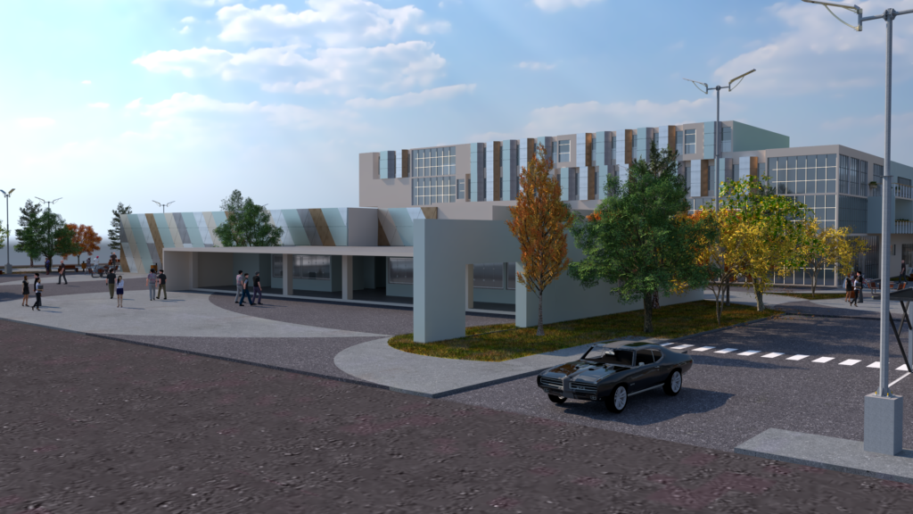
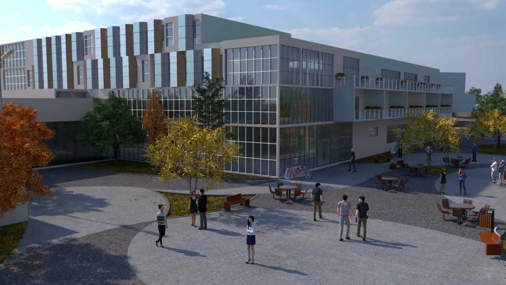
Ventilated Façade: Provided with a complete claddingsystem, incorporated into a laminated panel, it fully protectsthe property by providing thermal insulation through the air cushion between the wall and the laminated cladding basedon natural ventilation.
ZONING
FLOORS:
LANDSCAPING
INTERIOR DESIGN
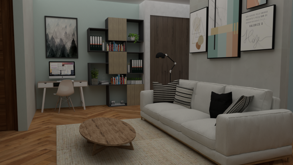
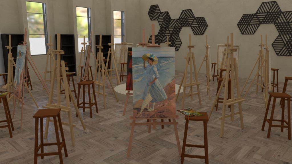
The Nordic style is characterized by the textile, the finishesand the textures as they play an important role. Despite itsversatility, the decoration revolves around clean lines, furniture that resists the passage of time, it is known for itsway of printing optimism. Seek future orientation byembracing modern ideas as a celebration of progress.
Material proposed in shared bedroom:
SHOWROOM
Spaces:
