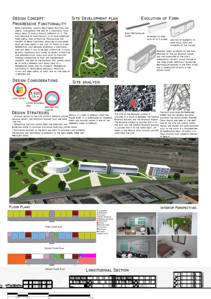
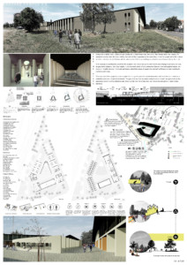
Design Concept: Progressive Functionality Being functional always meant being practical and useful. Challenging the idea of a functional thing would mean to have a radical approach to it. The main principle of functionality is to have something more useful than attractive. Radicalizing the concept of being functional would be to challenge what we know about it and look at things in a new perspective. Just because something is functional does not mean it has to be less attractive, it could be both. Something that makes an object attractive, like ornamentation, could also have its function. Through integration of past and contemporary concepts, the idea of the Bauhaus 2021 campus would be to have a newness that would lead to a progressive school for its students. Progressive functionality means being gradually practical. It may not seem useful at first, but as time goes by, it becomes one.
Site Analysis
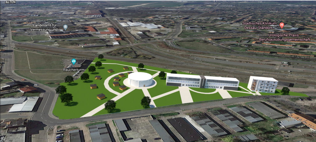
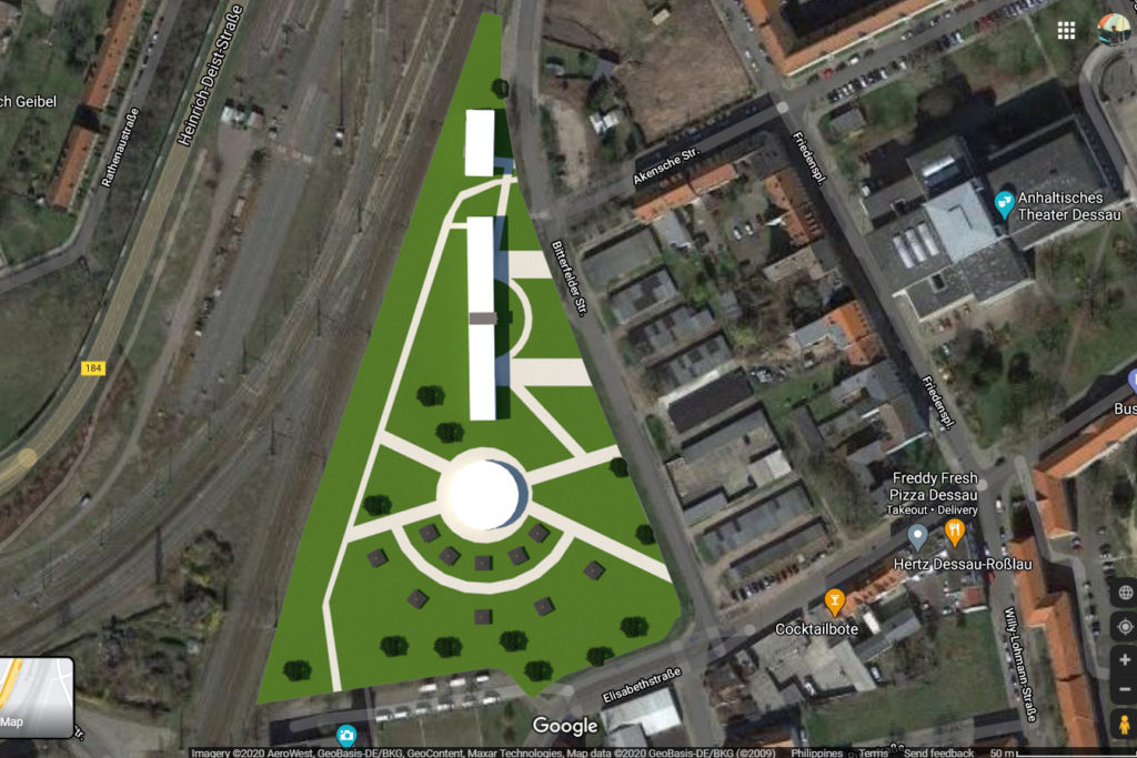
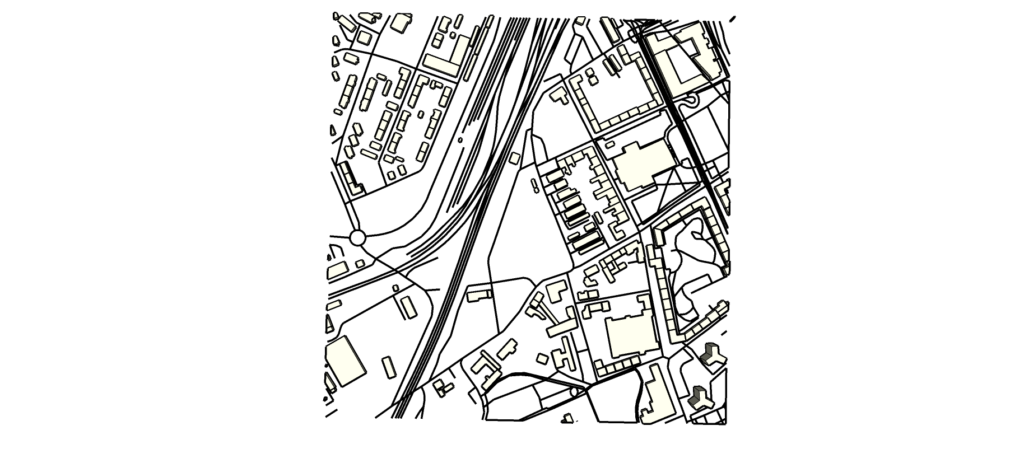
Dessau is a town in Germany near the Mulde river. It is surrounded by numerous parks and palaces making it one of the greenest towns in Germany. The site of the Bauhaus campus is situated in a space in between the Gropius Bauhaus building and the Bauhaus museum. The Bauhaus museum is located 600 m to the east and the Gropius Bauhaus building is located 600 m to the north west. Up north is the Dessau train station located 400m from the site. The east side faces Bitterfelder street and has several buildings including the Anhaltisches theater. Train tracks are seen at the west side of the site and across those tracks are houses and some buildings also. In the south is a Raucherturm or observation deck. Up north is a train station that connects Dessau to Berlin.
Evolution of Form
Basic rectangular shape Extruded 3d form with up to 3 floors Addition of elements to show focal point and symmetry of the facade Windows added according to the main principle of the old Bauhaus school and the character of the site’s surrounding context. Glass facade in the third floor, vertically elongated rectangular windows in the first floor, and a combination of both in the second floor.
Design considerations
- Site context
- Limited buildable area
- Weather and climate
Design strategies
Aligning design to the site context through limiting building height, and mimicking windows that are near the site Separating the main school from the dormitory and exhibition space to maximize site while complying limited space Positioning windows to the east and west to maximize light entering the building and positioning classrooms to the west where there are prevalent winds.
Floor plans
Ground floor plan
Second floor plan
Third floor plan
Classroom, workshops, hallway, mens restroom, womens restroom, auditorium, stairs, meeting room, cafeteria, restroom, kitchen, admin office,
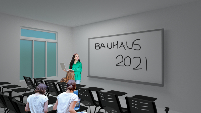
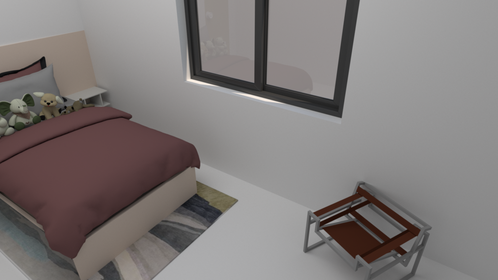
Interior perspectives
Longitudinal section
