MINOR PLUS
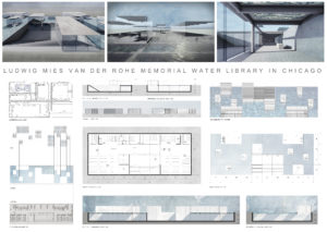
Together we have taken this project through the full process of architectural response; from site analysis to conceptual development, from massing to detailed design, and from a final design to a comprehensive presentation that incorporates both analogue and digital methods. We have brought together a cohesive and successful response to the brief that not only represents Mies Van Der Rohe and his amazing history, but also ourselves and our own values as designers.
INT./ EXT. BLENDING MODEL
A three-dimensional interpretation of our int./ext. blending concept that illustrates the panes physically.
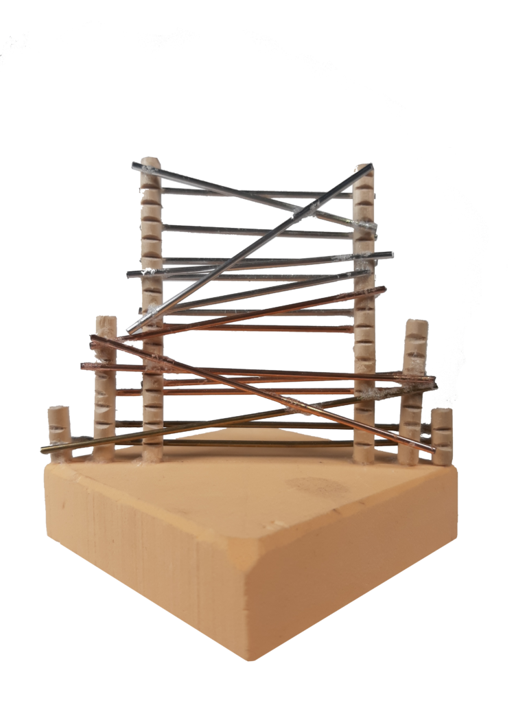
TENSION VIEWS/ MOVEMENT MODEL
A three-dimensional representation of our tension between views and movement on a singular axis concept that illustrates the features laterally.
STRATEGY #1: GRID
Extensive research into Mies’ IIT campus massing led us to discover his use of a strict grid system that we have employed ourselves.
STRATEGY #2: ACCESS
Through analysis of current site use and movement, we identified circulation corridors to maintain and strengthen.
STRATEGY #3: DAYLIGHTING
In order to create a sustainable design, we took great consideration when arranging the various openings, skylights, and lanterns.
STRATEGY #4: GEOMETRY
Taking inspiration from the grid, and our own interests, we employed a set of geometrical systems which results in a harmonious response.
STRATEGY #5: INT./ EXT.
Drawing from one of our initial concepts, we aimed to soften and manipulate the transitions between int./ ext. whilst defining spaces within.
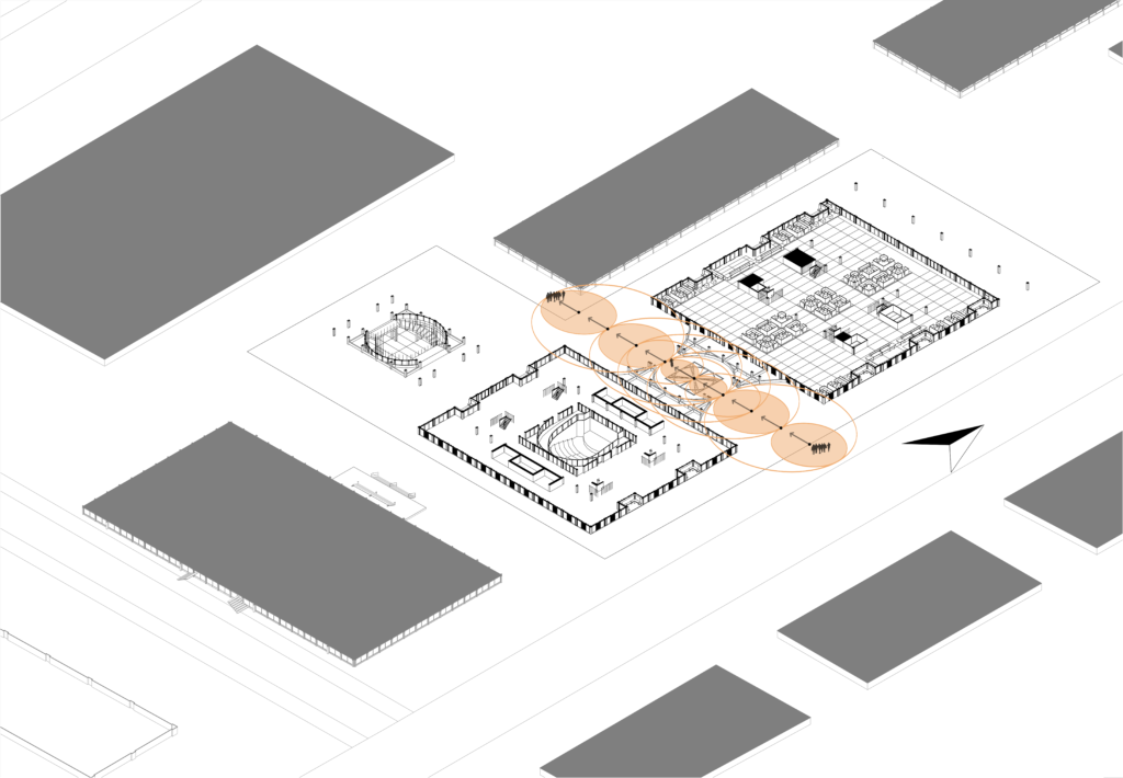
STRATEGY #6: VIEWS/ MOVEMENT
Influenced by another concept, we aimed to induce movement through creating a series of centres which guides the user through the exterior spaces.
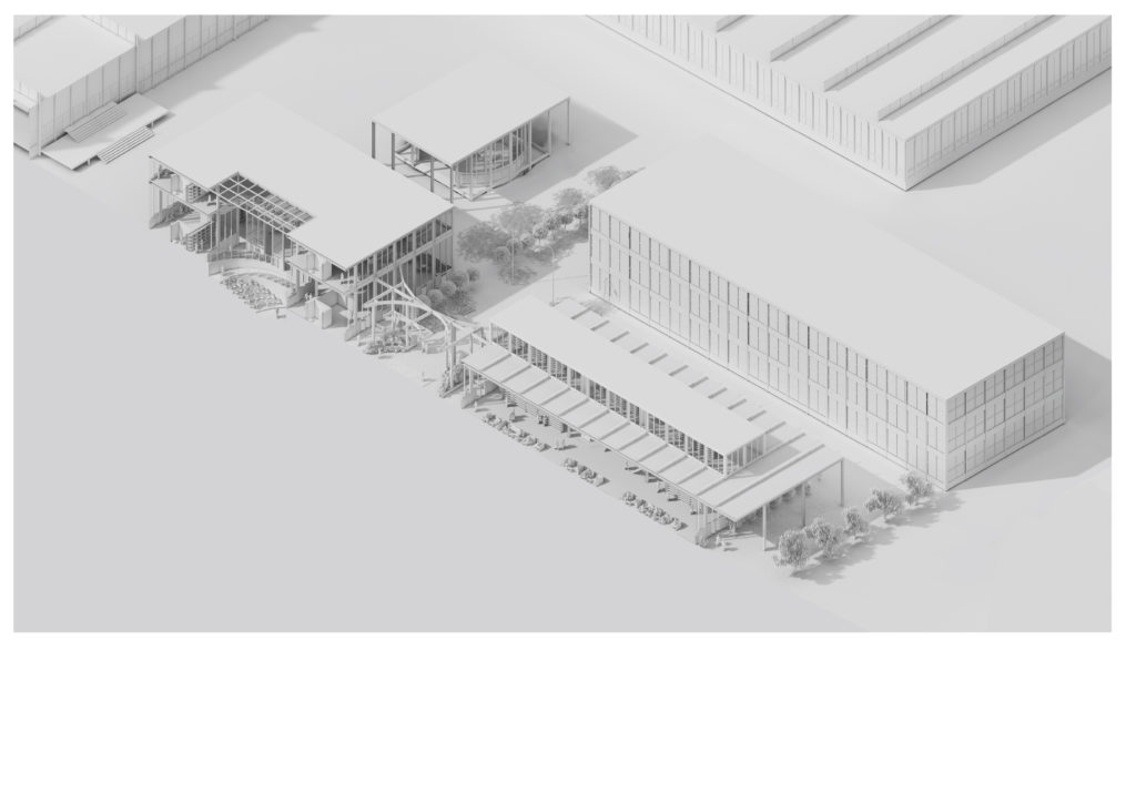
EXTERNAL PAVILION
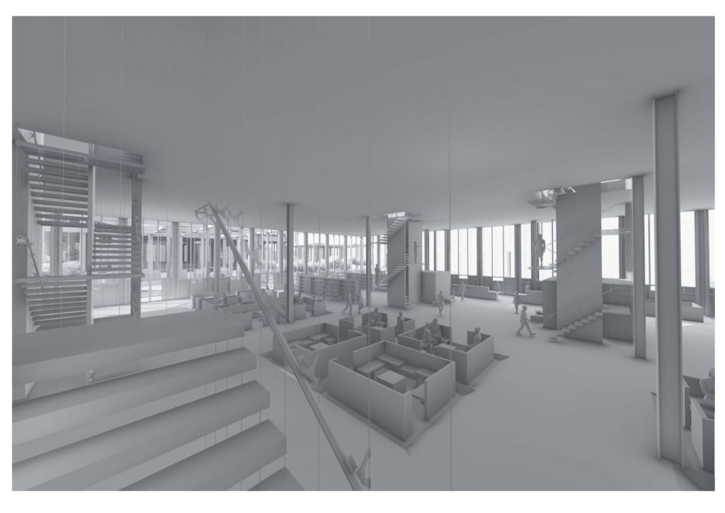
INTERNAL LIBRARY
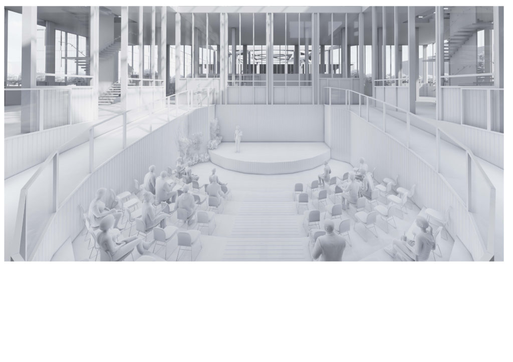
INTERIOR AUDITORIUM
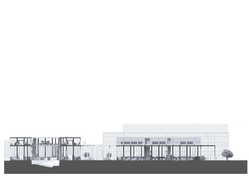
SECTIONAL AXOMETRIC
GROUND/ BASEMENT F. PLAN
FIRST F. PLAN
200 READING/ STUDY STATIONS
The Reading and Studying areas are placed throughout the entire two buildings, these spaces are located in the borders and in the centre of the buildings, in order to make the spaces more private, the studying spaces are positioned as cubicles. These areas measure 800 m2.
SHELVING FOR THE 60K BOOKS
The shelves where the books will be storage are located along the library Ground floor and First floor, the shelves are also shaping the spaces in order to create a private area for people studying. It has an area of 800 m2.
RESEARCH STATIONS
In the southern side of our site, the building is dedicated for Research Stations, the area covered for this activity is 50 m2, the area is surrounding the auditorium where teaching can take place. This place has direct vistas into the auditorium, it has a cafe area and accessibility areas are place in the perimeter of the main space.
COPY ROOM
The copy room spaces are located in the centre of the building where it can be accessed from any part of the building, this is to facilitate the study and research of people using the studying areas. These spaces measure 50m2.
CAFETERIA
Cafeteria spaces have been placed in both building that have studying areas, these spaces are position at ground level in order to make it accessible for everyone and are mainly place in the centre of the building. It measures 200 m2.
CIVIC SPACE
The civic spaces are located in the front facade, read of the building and on both sides of the building. They are covered by loggias and seating areas formed by the external façades.
SEAT AUDITORIUM
The seated auditorium space is an area where teaching can take place, as well as any importance talks or lectures, it is surrounded by research stations so everyone can have a glance of what is happening inside and join if the event is public. The auditorium has been placed at underground level, so it creates a sense of privacy. The Auditorium area is 100 m2.
ADMINISTRATION AND STAFF FACILITIES
The administration and staff facilities have been placed in the centre of the building; this way people who enter from both sides of the building can find the administration area easier. The Administration and staff offices area is 70 m2.
WELCOME AREA
The welcome areas are the before the main building’s entrances, these spaces are loggias and are meant to cover and welcome the visitors before they are inside the library. These spaces are strongly connected to the nature of the immediate context.
BATHROOMS
Bathrooms are located in the centre of both buildings, and this is to make it easier for anyone to find them, these area is 50 m2.
STAIRCASES
The staircases connect both levels, they have been placed in the centre as it is accessible for anyone.
MIES COLLECTION
These area is to displace the work and collection of Mies Van de Rohe.
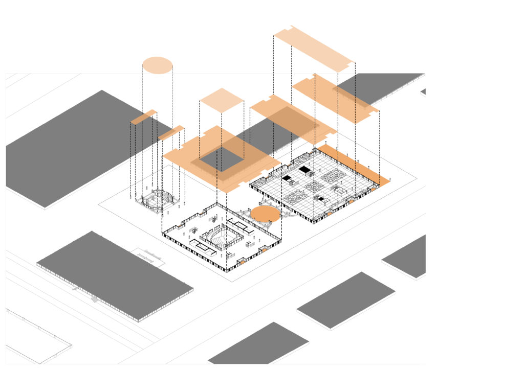
EXPLODED AXONOMETRIC
1 MAIN LIBRARY STRUCTURE
2 PAVILION ROTUNDA
3 MAIN AUDITORIUM STRUCTURE
4 MIES COLLECTION STRUCTURE
5 EXTERIOR SEATING
6 INTERIOR STRUCTURE
7 LIFT MASSING
8 EXTERNAL GROUND F. CLADDING
9 COLUMN STRUCTURE
10 ORNATE STAIRS
11 UPPER FLOOR/ ROOF
12 ROOF FINNING
13 EXTERNAL 1ST F. CLADDING
14 UPPER ROOF
15 RAISED GEOMETRIC PAVILION
16 PAVILION COLUMN STRUCTURE
17 UPPER GEOMETRIC PAVILION
18 UNDERGROUND MIES COLLECTION
19 DISPLAY STRUCTURES
20 EXTERNAL SEATING
21 INNER AUDITORIUM GLAZING
22 GROUND F. CORES
23 EXTERNAL GROUND F. CLADDING
24 ORNATE STAIRS
25 COLUMN STRUCTURE
26 UPPER FLOOR
27 FIRST F. CORE
28 RESEARCH STATIONS
29 EXTERNAL 1ST F. CLADDING
30 UPPER ROOF
31 SKYLIGHT
32 EXTERNAL ROTUNDA GLAZING
33 ORNATE STAIRS TO COLLECTION
34 COLUMN STRUCTURE
35 UPPER ROOF

