origin
One of the modernist slogans describing the influence of architecture on humans is «everything is visual». Despite the increasing awareness among contemporary architects and researchers of the influence that architecture has on the multisensory nature of man, this trend remains a niche. We still face problems such as «light hunger» or «seasonal affective disorder» mainly caused by focusing on the visual layer when designing architecture.
idea
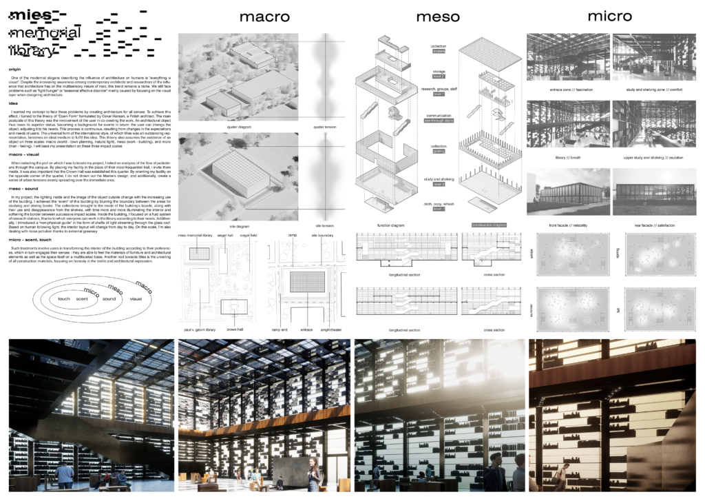
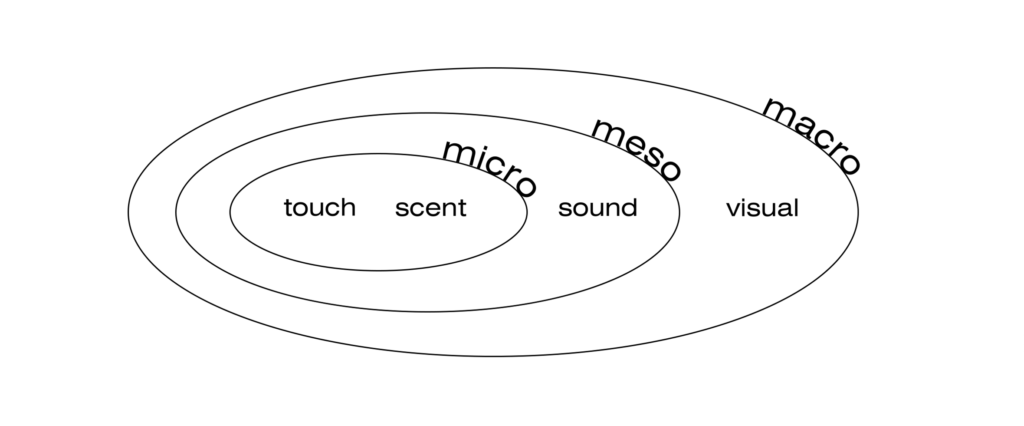
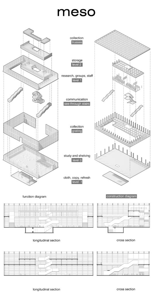
I wanted my concept to face these problems by creating architecture for all senses. To achieve this effect, I turned to the theory of «Open Form» formulated by Oskar Hansen, a Polish architect. The main postulate of this theory was the involvement of the user in co-creating the work. An architectural object thus loses its superior status, becoming a background for events in return. the user can change the object, adjusting it to his needs. This process is continuous, resulting from changes in the expectations and needs of users. The universal form of the international style, of which Mies was an outstanding representative, becomes an ideal medium to fulfill this idea. This theory also assumes the existence of an object on three scales: macro (world – town planning, natural light), meso (work – building), and micro (man – feeling). I will base my presentation on these three impact scales
macro – visual
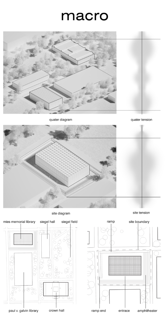
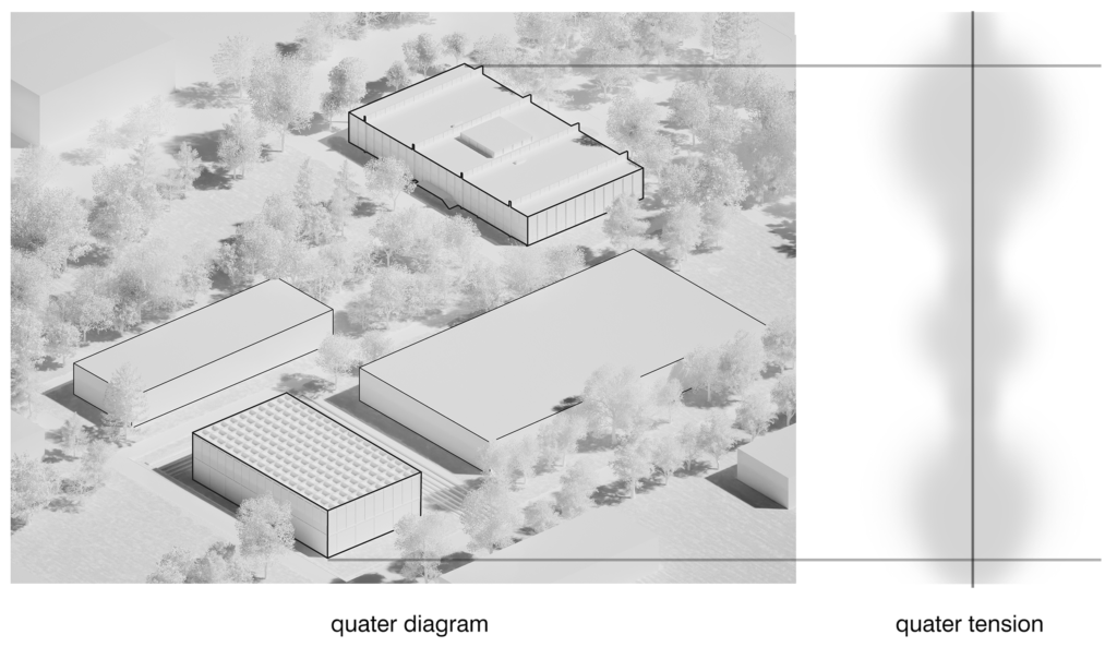
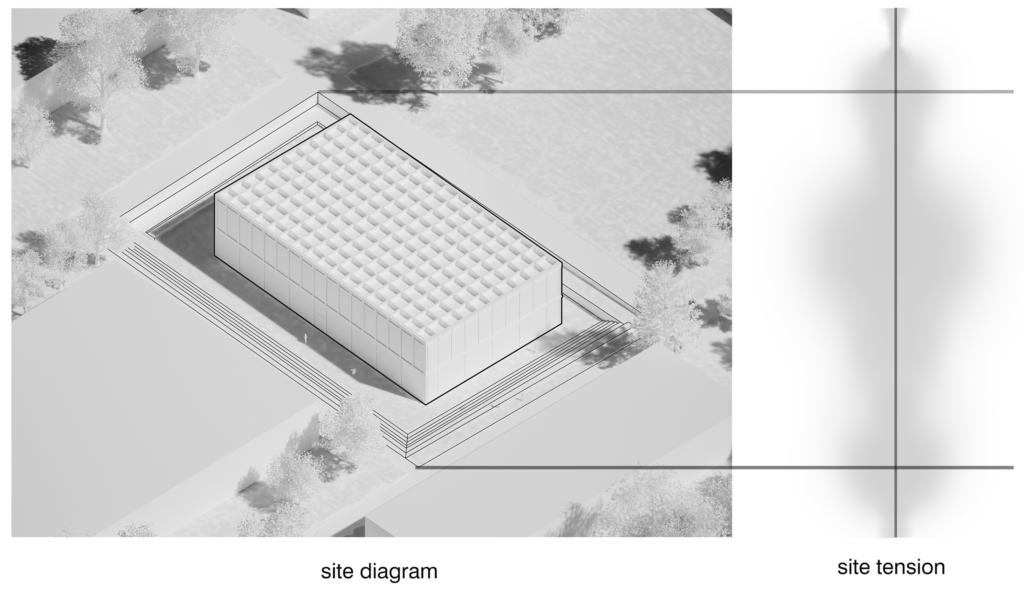
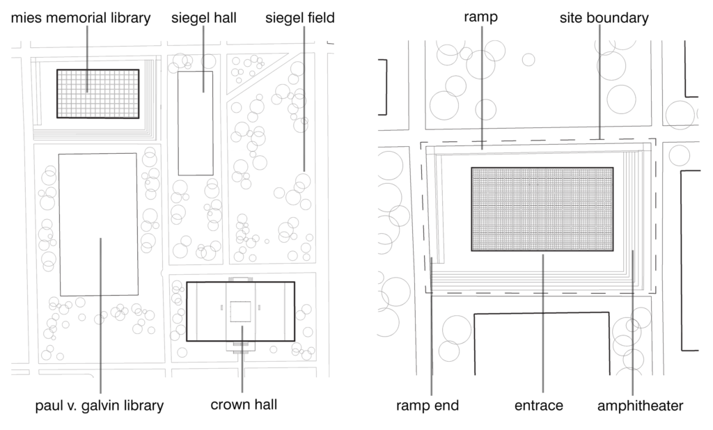
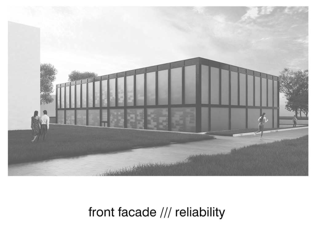
When selecting the plot on which I was to locate my project, I relied on analyzes of the flow of pedestrians through the campus. By placing my facility in the place of their most-frequented trail, I invite them inside. It was also important that the Crown Hall was established this quarter. By orienting my facility on the opposite corner of the quarter, I do not drown out the Master’s design, and additionally, create a series of urban tensions evenly spreading over the immediate area.
meso – sound
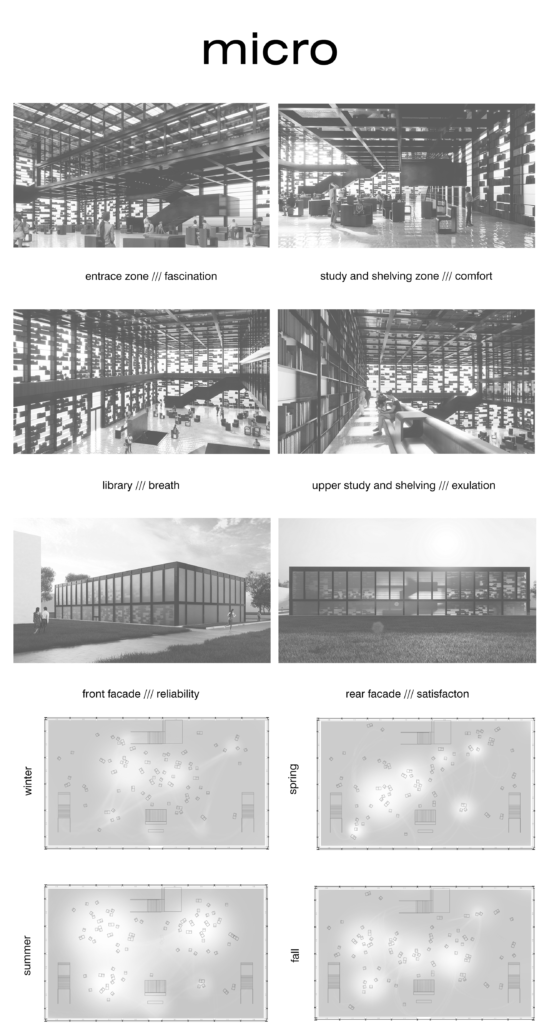
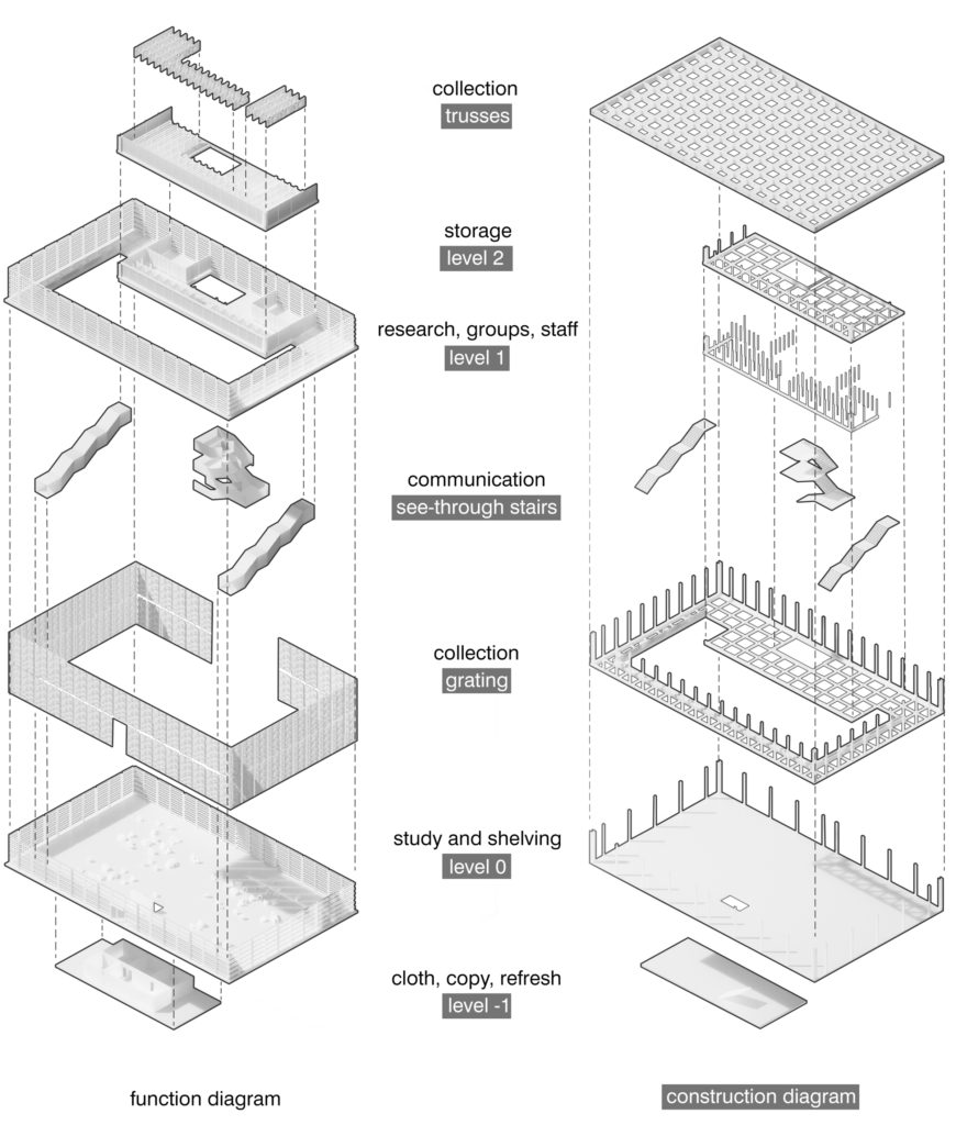
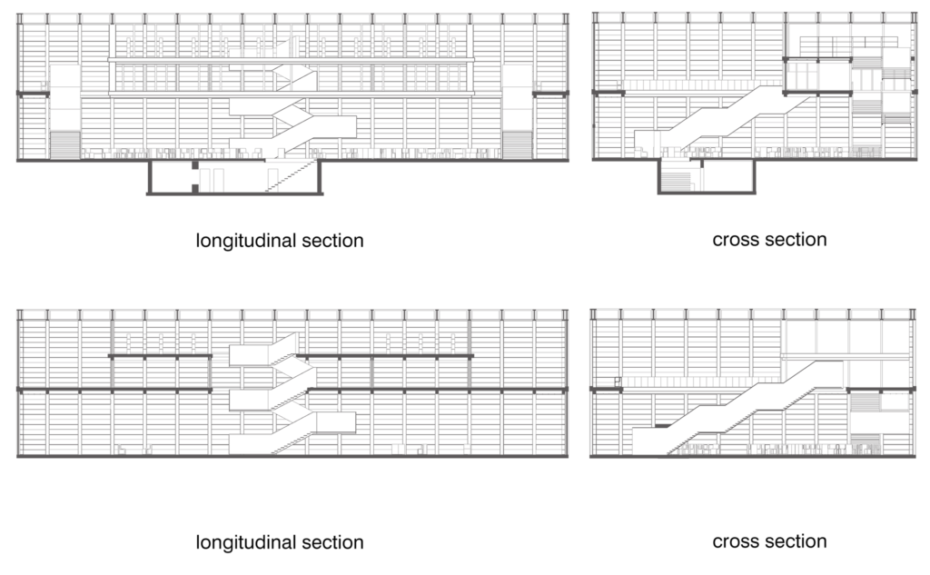
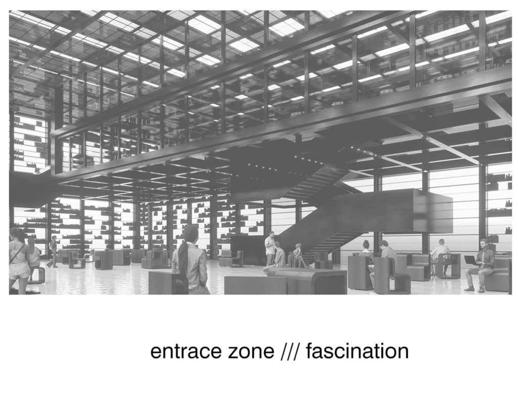
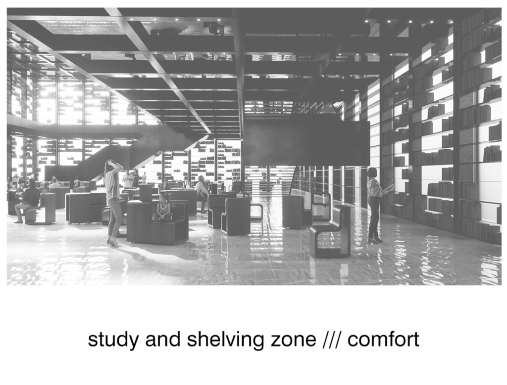
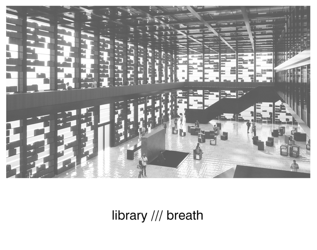
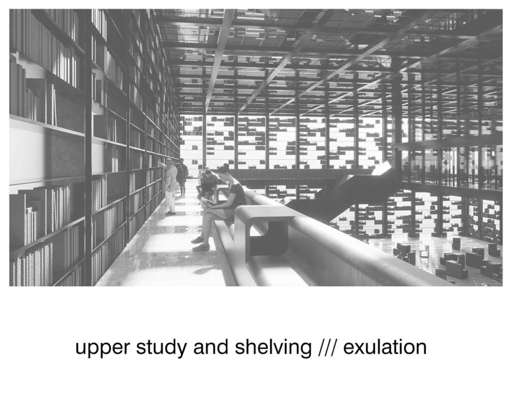
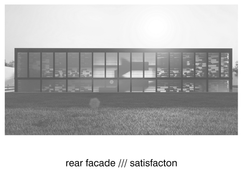
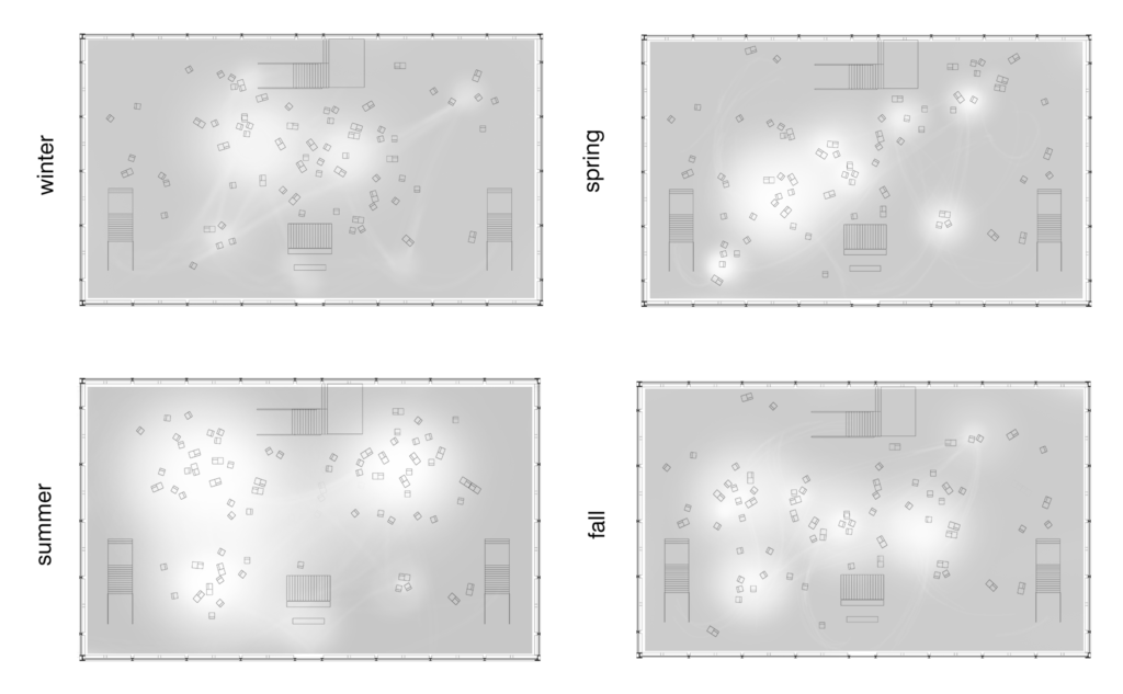
In my project, the lighting inside and the image of the object outside change with the increasing use of the building. I achieved the «event» of this building by blurring the boundary between the areas for studying and storing books. The collections brought to the inside of the building’s facade, along with their use and disappearance from the shelves, with time more and more illuminating the interior and softening the border between successive impact scales. Inside the building, I focused on a fluid system of research stations, thanks to which everyone can work in the library according to their needs. Additionally, I introduced a «non-physical guide» in the form of shafts of light streaming through the glass roof. Based on human following light, the interior layout will change from day to day. On this scale, I’m also dealing with noise pollution thanks to extrernal greenery.
micro – scent, touch
Such treatments involve users in transforming the interior of the building according to their preferences, which in turn engages their senses – they are able to feel the materials of furniture and architectural elements as well as the space itself on a multifaceted basis. Another nod towards Mies is the unveiling of all construction materials, focusing on honesty in the textile and architectural expression.
