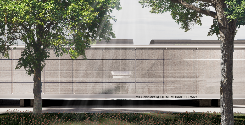
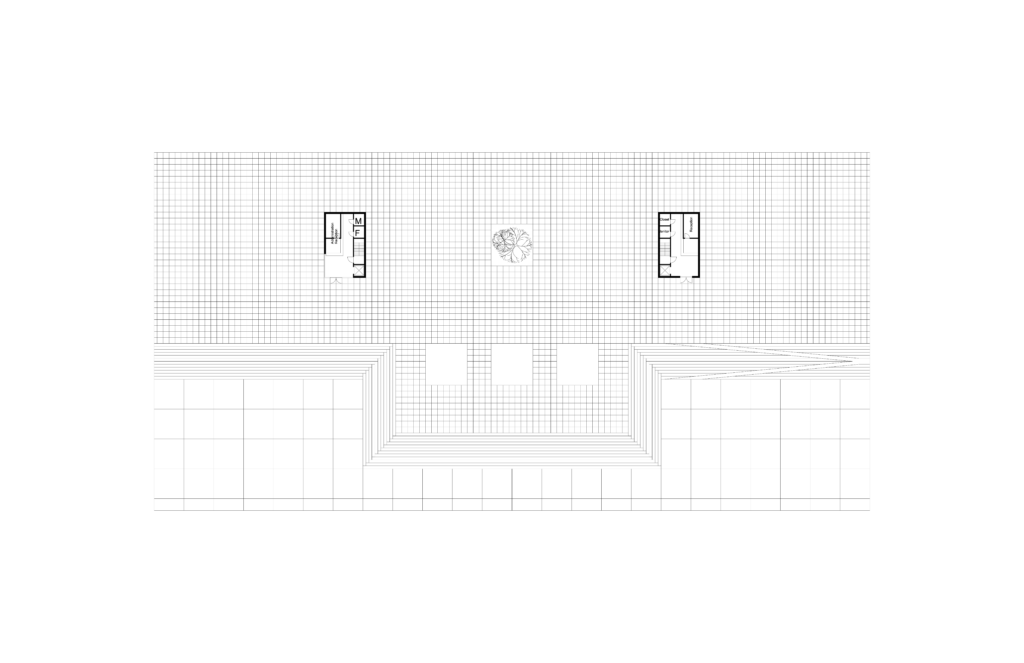
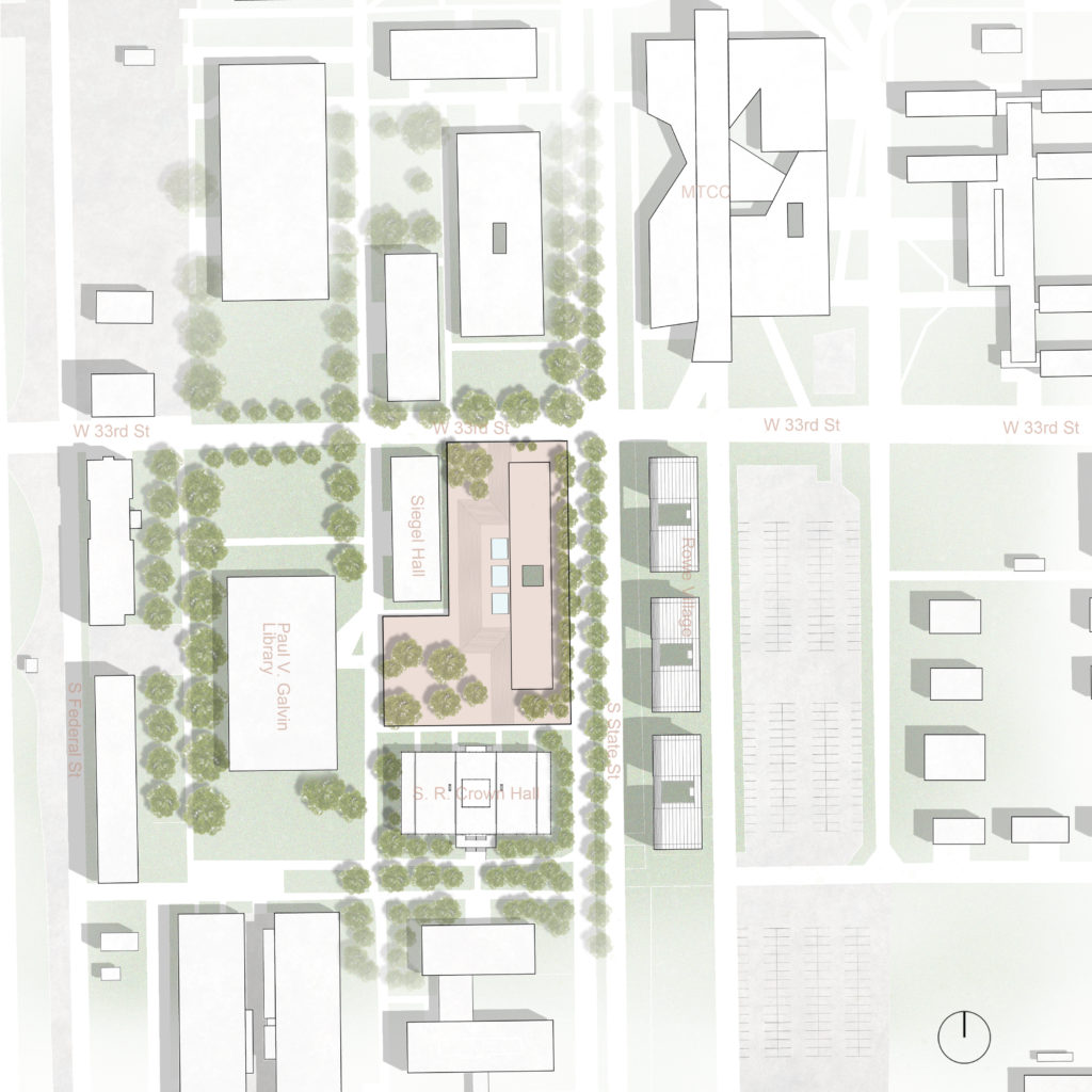
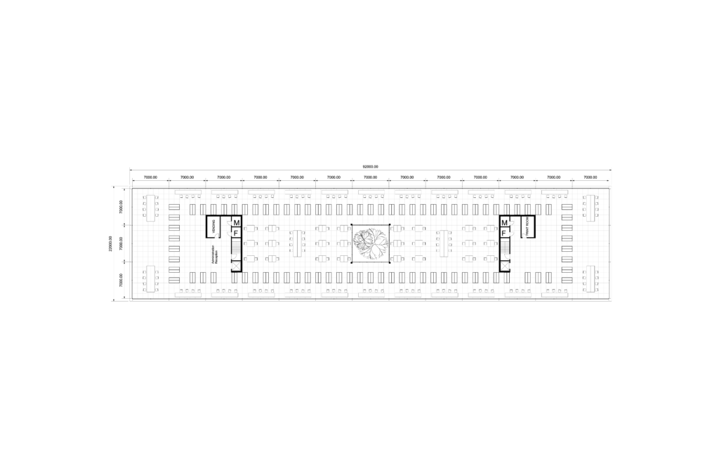
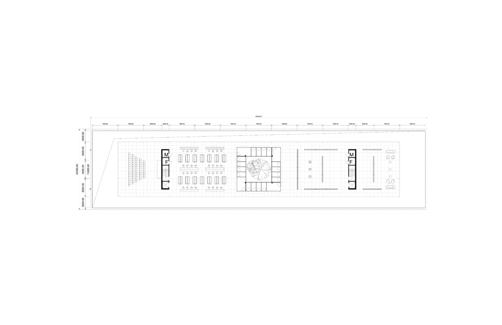
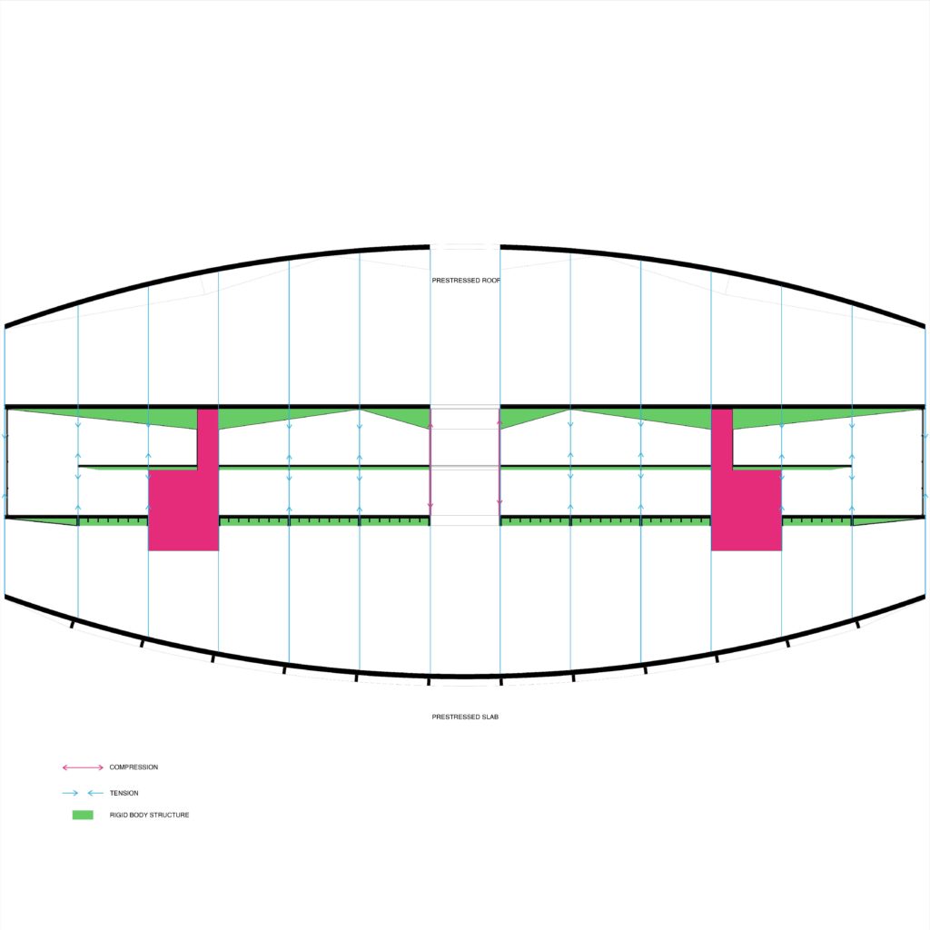
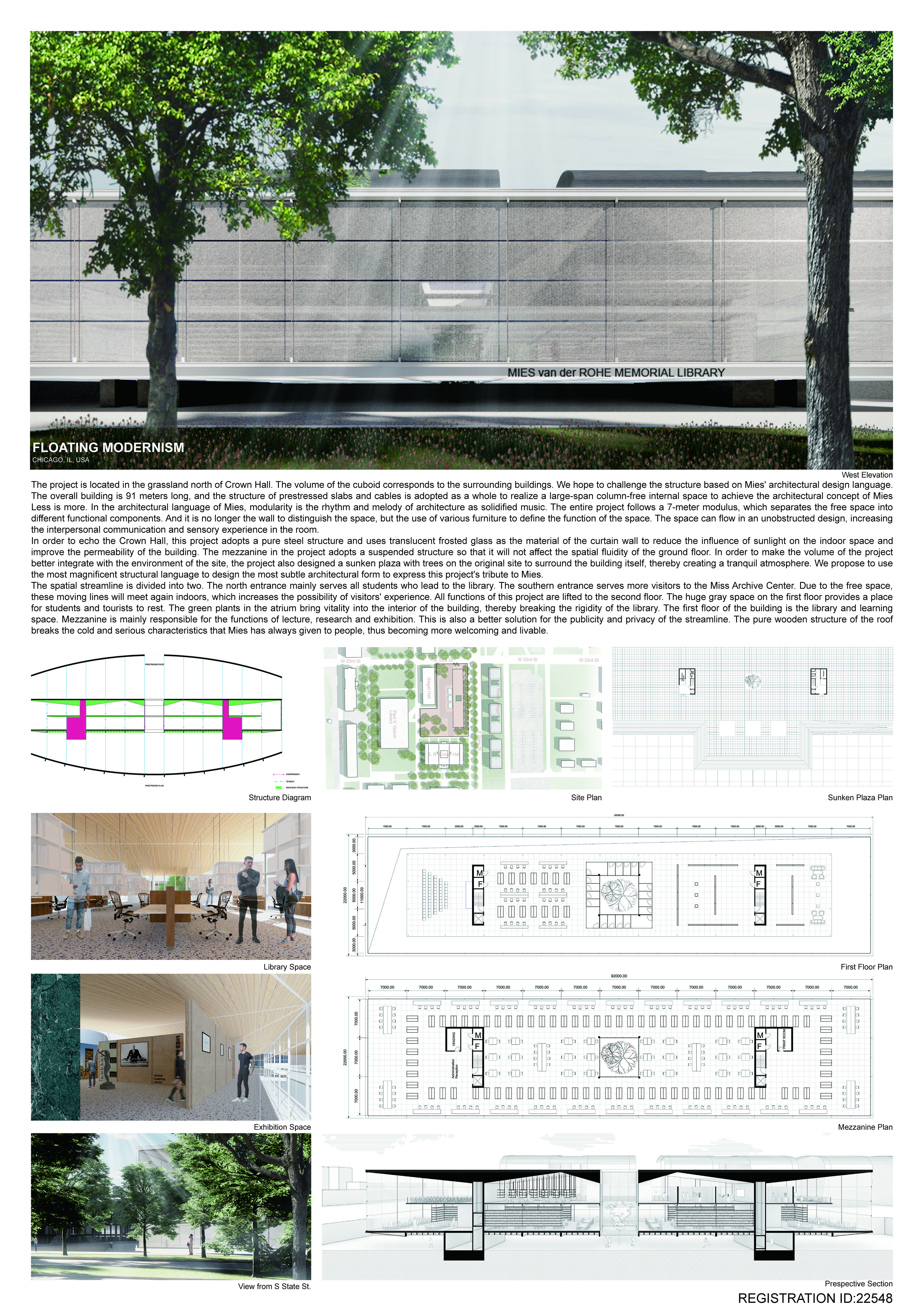
The project is located in the grassland north of Crown Hall. The volume of the cuboid corresponds to the surrounding buildings. We hope to challenge the structure based on Mies’ architectural design language. The overall building is 91 meters long, and the structure of prestressed slabs and cables is adopted as a whole to realize a large-span column-free internal space to achieve the architectural concept of Mies Less is more. In the architectural language of Mies, modularity is the rhythm and melody of architecture as solidified music. The entire project follows a 7-meter modulus, which separates the free space into different functional components. And it is no longer the wall to distinguishes the space, but the use of various furniture to define the function of the space. The space can flow in an unobstructed design, increasing the interpersonal communication and sensory experience in the room.
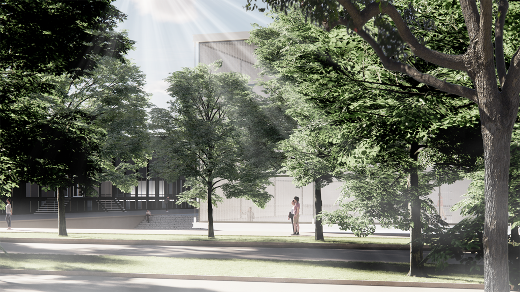
In order to echo the Crown Hall, this project adopts a pure steel structure and uses translucent frosted glass as the material of the curtain wall to reduce the influence of sunlight on the indoor space and improve the permeability of the building. The mezzanine in the project adopts a suspended structure so that it will not affect the spatial fluidity of the ground floor. In order to make the volume of the project better integrated with the environment of the site, the project also designed a sunken plaza with trees on the original site to surrounding the building itself, thereby creating a tranquil atmosphere. We propose to use the most magnificent structural language to design the most subtle architectural form to express this project’s tribute to Mies.
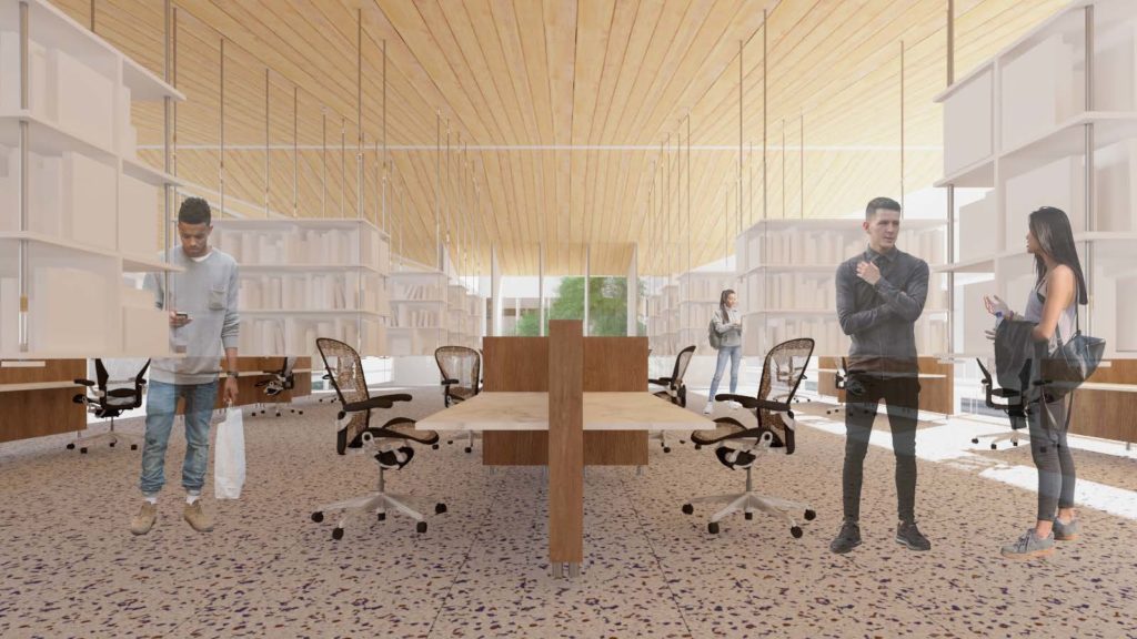
The spatial streamline is divided into two. The north entrance mainly serves all students who lead to the library. The southern entrance serves more visitors to the Miss Archive Center. Due to the free space, these moving lines will meet again indoors, which increases the possibility of visitors’ experience. All functions of this project are lifted to the second floor. The huge gray space on the first floor provides a place for students and tourists to rest. The green plants in the atrium bring vitality into the interior of the building, thereby breaking the rigidity of the library. The first floor of the building is the library and learning space. The mezzanine is mainly responsible for the functions of lecture, research, and exhibition. This is also a better solution for the publicity and privacy of the streamline. The pure wooden structure of the roof breaks the cold and serious characteristics that Mies has always given to people, thus becoming more welcoming and livable.
Floating Modernism
This project was submited to the Finalists competition with Registration ID #22548
WWC
Zidong Guo
Washington University in St. Louis
rivolavich
Junfu Cui
Cornell University
junfucui
Zhixuan Shen
Washington University in St. Louis
read more +
