BAUHAUS CAMPUS 2021
The intentions
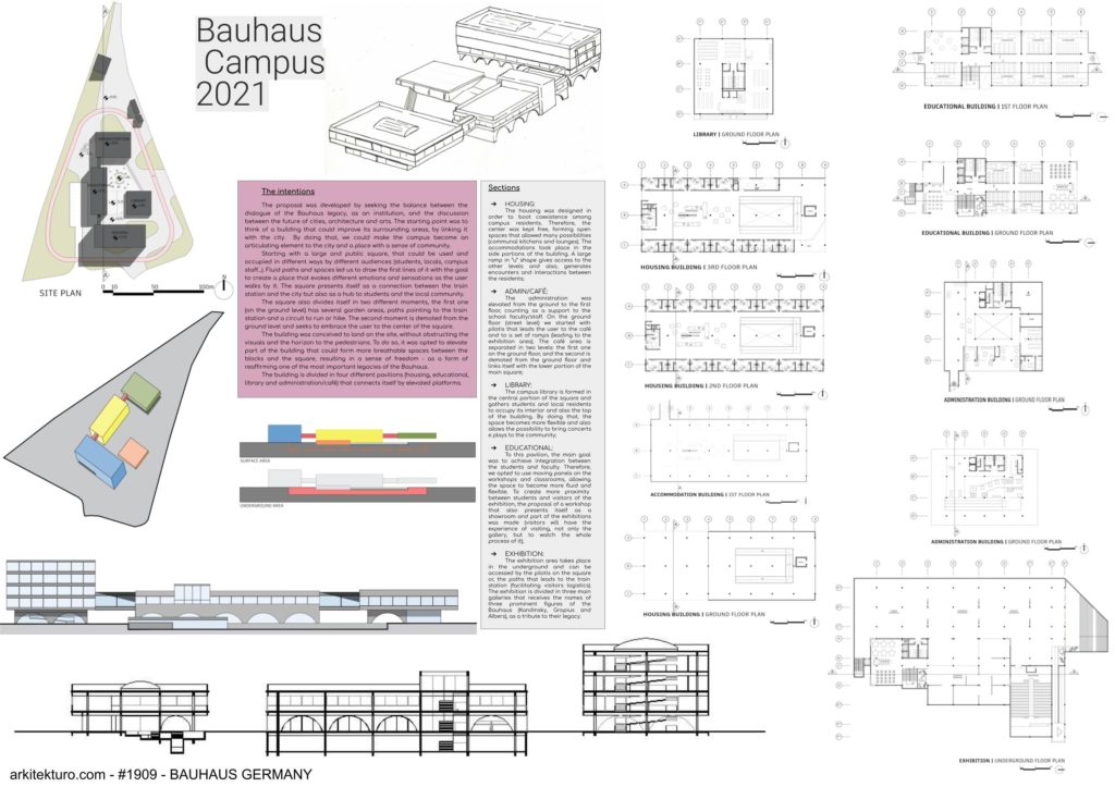
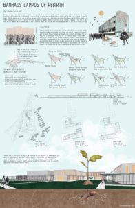
The proposal was developed by seeking the balance between the dialogue of the Bauhaus legacy, as an institution, and the discussion between the future of cities, architecture and arts. The starting point was to think of a building that could improve its surrounding areas, by linking it with the city. By doing that, we could make the campus become an articulating element to the city and a place with a sense of community.
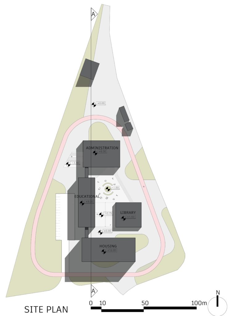
Starting with a large and public square, that could be used and occupied in different ways by different audiences (students, locals, campus staff…). Fluid paths and spaces led us to draw the first lines of it with the goal to create a place that evokes different emotions and sensations as the user walks by it. The square presents itself as a connection between the train station and the city but also as a hub to students and the local community.
The square also divides itself in two different moments, the first one (on the ground level) has several garden areas, paths pointing to the train station and a circuit to run or hike. The second moment is demoted from the ground level and seeks to embrace the user to the center of the square.
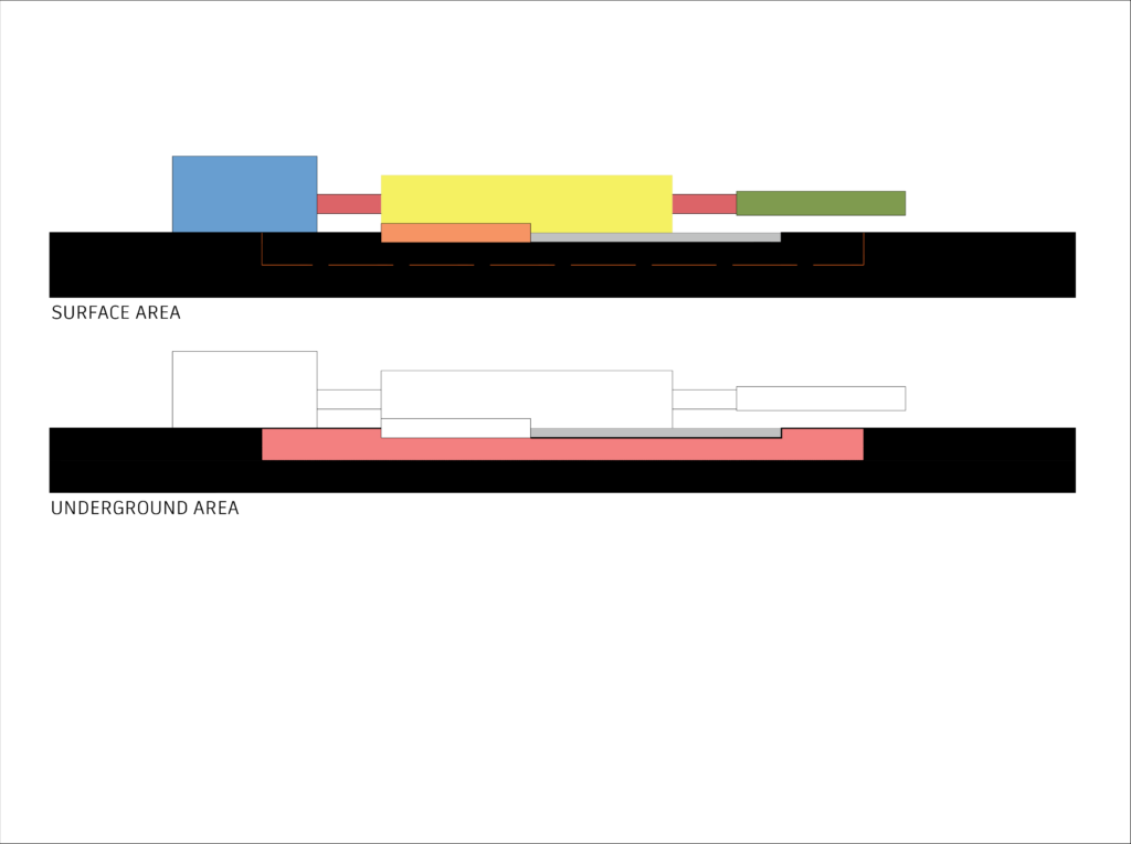
The building was conceived to land on the site, without obstructing the visuals and the horizon to the pedestrians. To do so, it was opted to elevate part of the building that could form more breathable spaces between the blocks and the square, resulting in a sense of freedom – as a form of reaffirming one of the most important legacies of the Bauhaus.
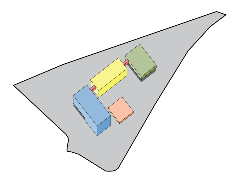
The building is divided in four different pavilions (housing, educational, library and administration/café) that connects itself by elevated platforms.
Sections
- HOUSING:
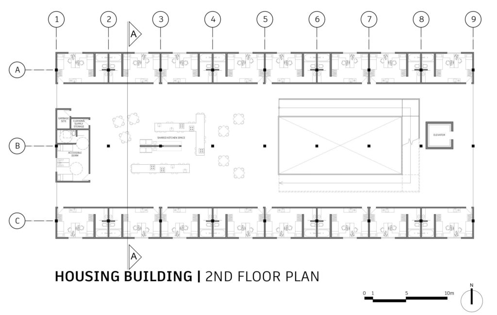
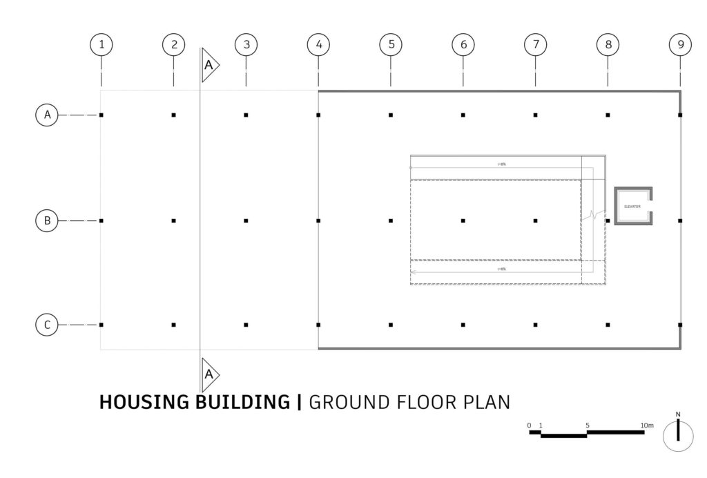
The housing was designed in order to boot coexistence among campus residents. Therefore, the center was kept free, forming open spaces that allowed many possibilities (communal kitchens and lounges). The accommodations took place in the side portions of the building. A large ramp in “u” shape gives access to the other levels and also, generates encounters and interactions between the residents;
- ADMIN/CAFÉ:
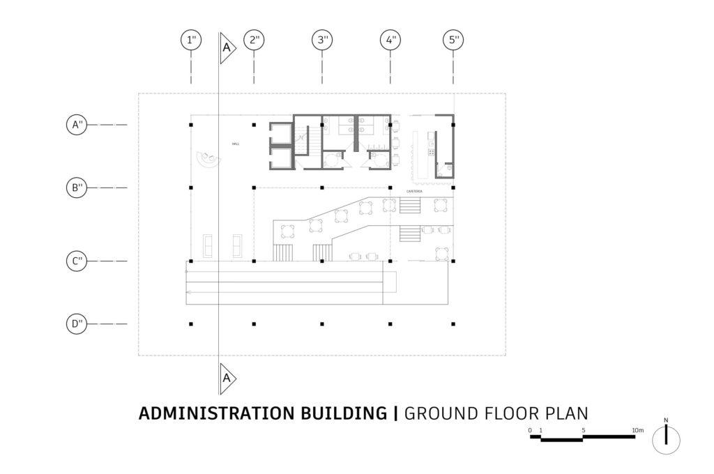
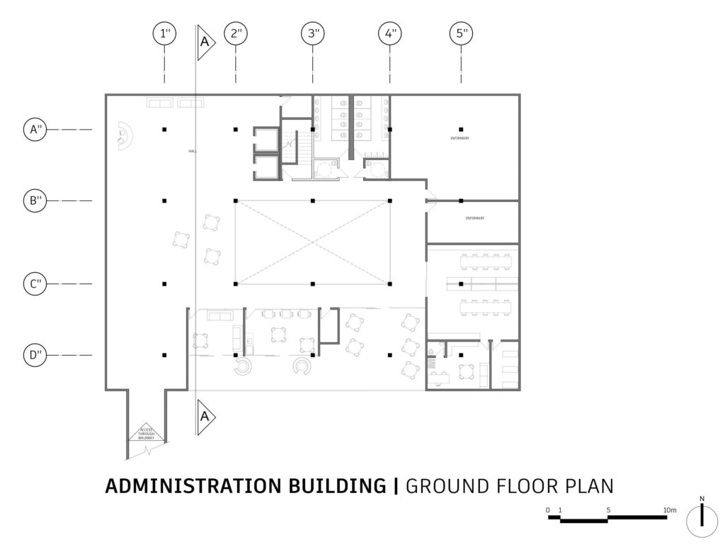
The administration was elevated from the ground to the first floor, counting as a support to the school faculty/staff. On the ground floor (street level) we started with pilotis that leads the user to the café and to a set of ramps (leading to the exhibition area). The café area is separated in two levels: the first one on the ground floor, and the second is demoted from the ground floor and links itself with the lower portion of the main square;
- LIBRARY:
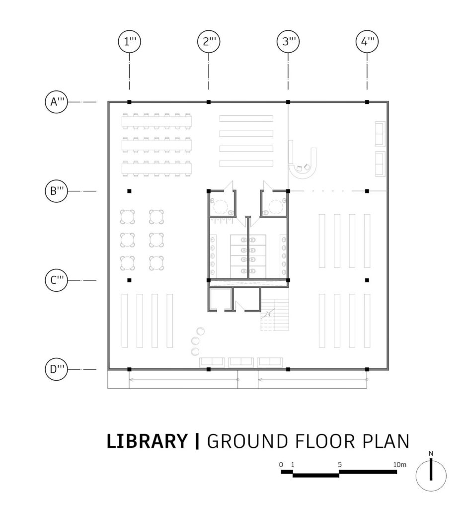
The campus library is formed in the central portion of the square and gathers students and local residents to occupy its interior and also the top of the building. By doing that, the space becomes more flexible and also allows the possibility to bring concerts e plays to the community;
- EDUCATIONAL:
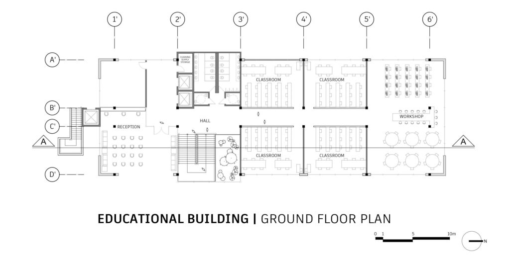
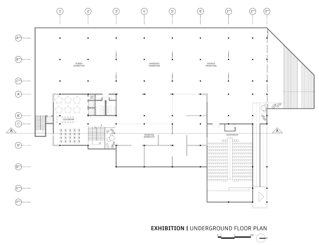
To this pavilion, the main goal was to achieve integration between the students and faculty. Therefore, we opted to use moving panels on the workshops and classrooms, allowing the space to become more fluid and flexible. To create more proximity between students and visitors of the exhibition, the proposal of a workshop that also presents itself as a showroom and part of the exhibitions was made (visitors will have the experience of visiting, not only the gallery, but to watch the whole process of it);
- EXHIBITION:
The exhibition area takes place in the underground and can be accessed by the pilotis on the square or, the paths that leads to the train station (facilitating visitors logistics). The exhibition is divided in three main galleries that receives the names of three prominent figures of the Bauhaus (Kandinsky, Gropius and Albers), as a tribute to their legacy.
